Project Overview
As part of the Pride Center’s visual refresh, I developed updated logo variations to better reflect its evolving space and community presence. The goal was to create a mark that felt inclusive, adaptable, and recognizable across both digital and physical environments.

New Logo, Project Linked
About The Project
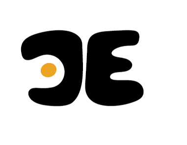
Alongside the primary logo system, I developed a simplified secondary mark designed for more informal and community-driven applications. This mark functions as a flexible visual element that complements the core identity without competing with it.
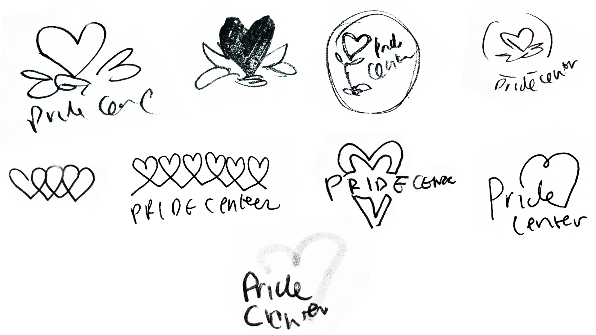
The Challenge:
The challenge was creating a secondary mark that could extend the Pride Center’s identity without duplicating the primary logo. It needed to feel connected to the core brand while functioning independently in more informal and community-facing contexts.
The mark also had to remain simple and scalable, working effectively at small sizes across merchandise and printed materials.
official logo
rainbow

single color
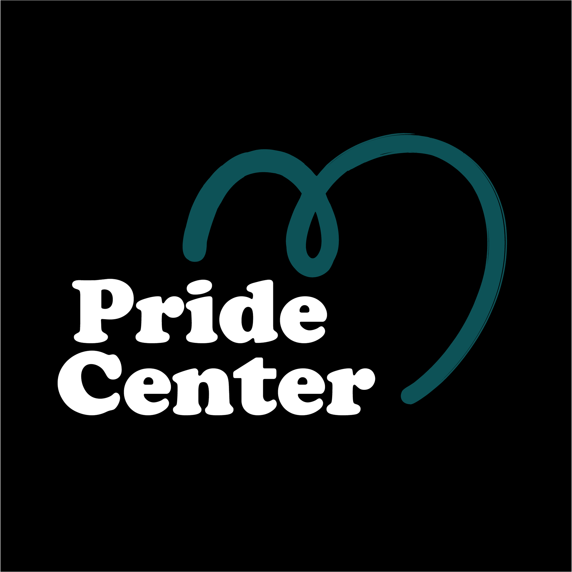
dark background official logo
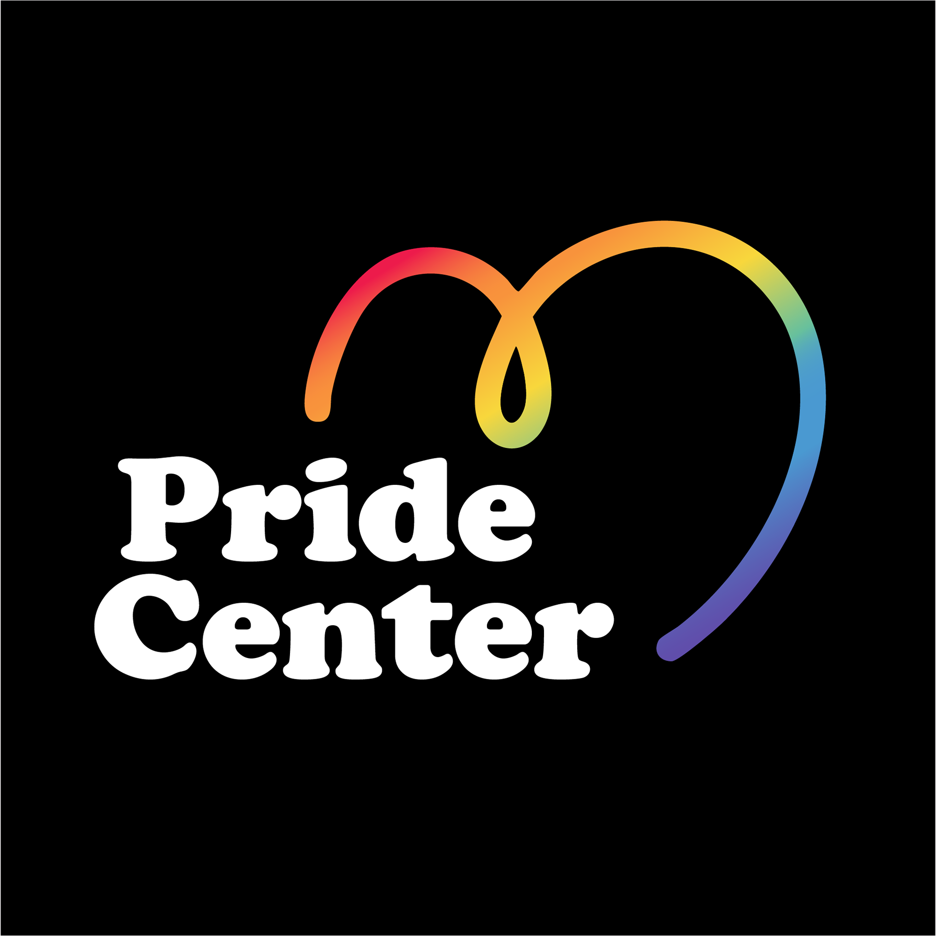
rainbow on black
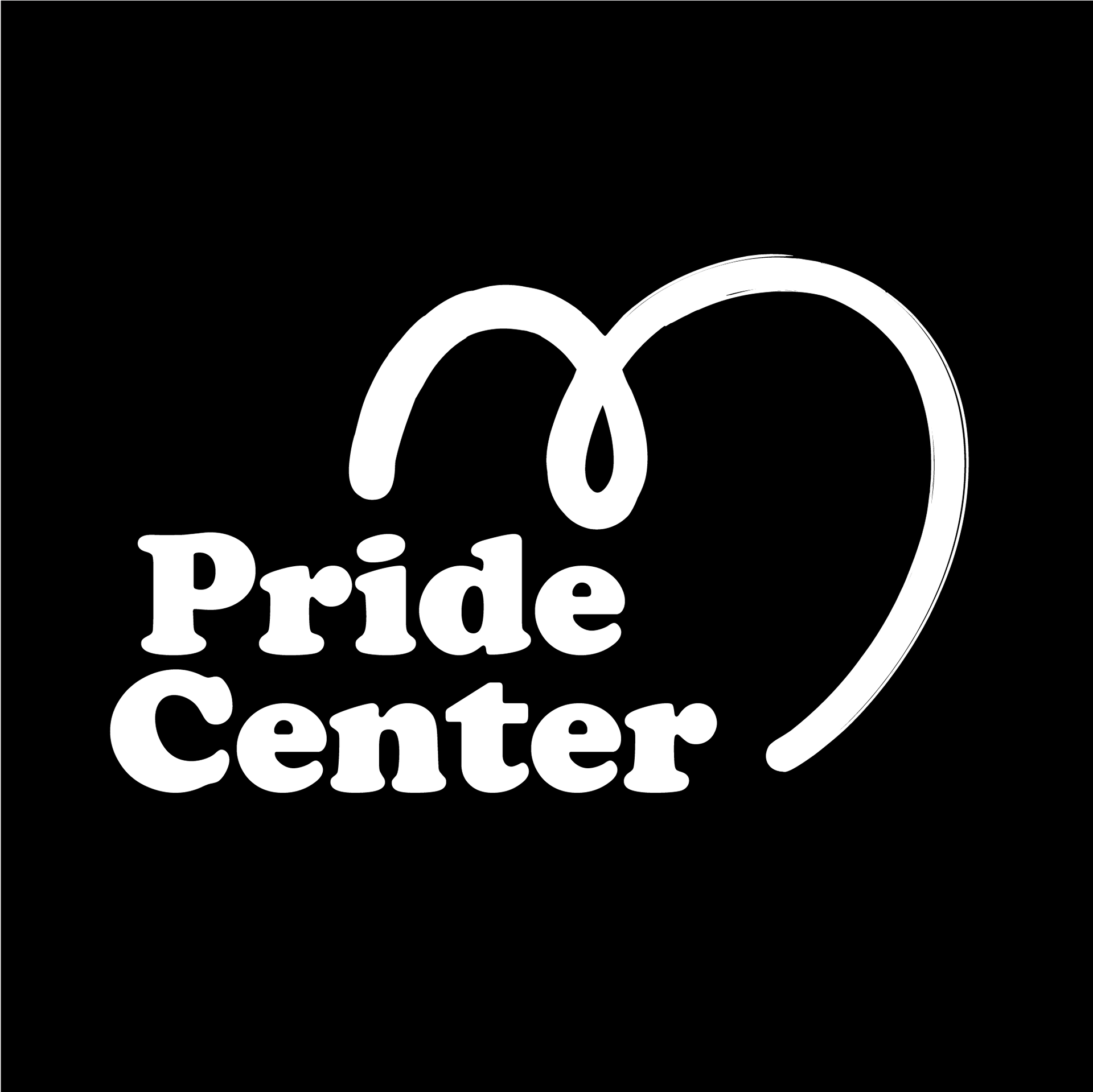
single color on dark background
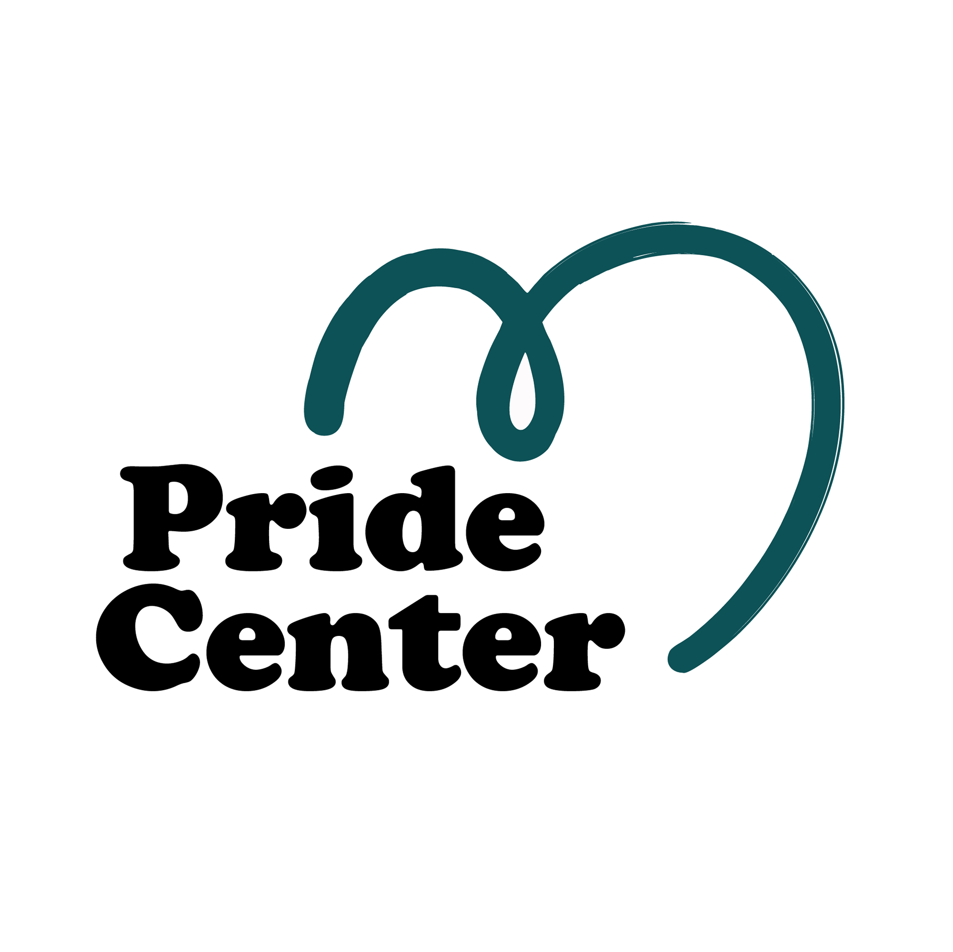
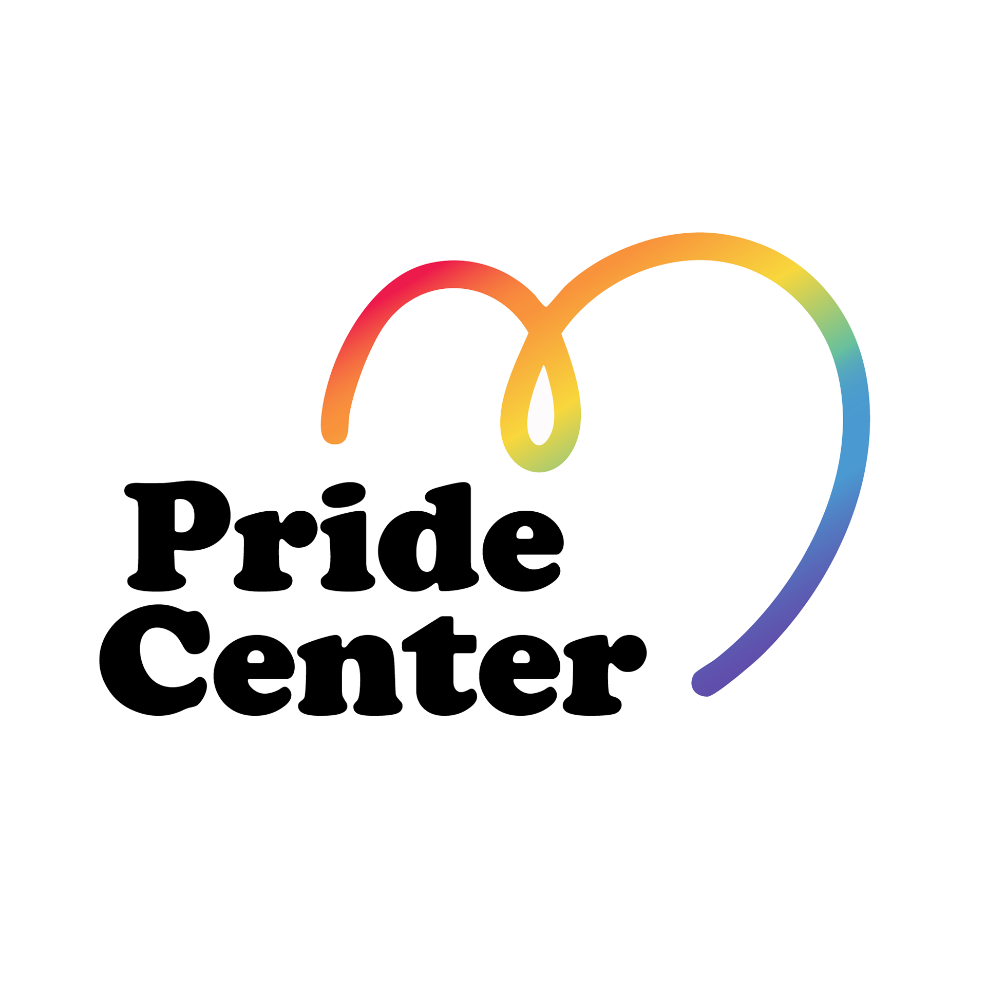
The Concept:
The form is minimal and fluid, designed to feel open, welcoming, and expressive. Its continuous linework creates a sense of connection and softness, reinforcing the Pride Center’s emphasis on inclusivity and care. Unlike the primary logo, this mark was intentionally designed to live in more casual spaces, where personality and approachability matter most.
The OUtcome:
The secondary mark became a subtle but recognizable symbol within the Pride Center’s visual ecosystem. Its simplicity made it ideal for stickers and small-scale applications, allowing it to circulate organically among students and community members.
By living in these everyday touchpoints, the mark strengthens brand recognition in a softer, more approachable way. Rather than competing with the primary identity, it supports and expands it.