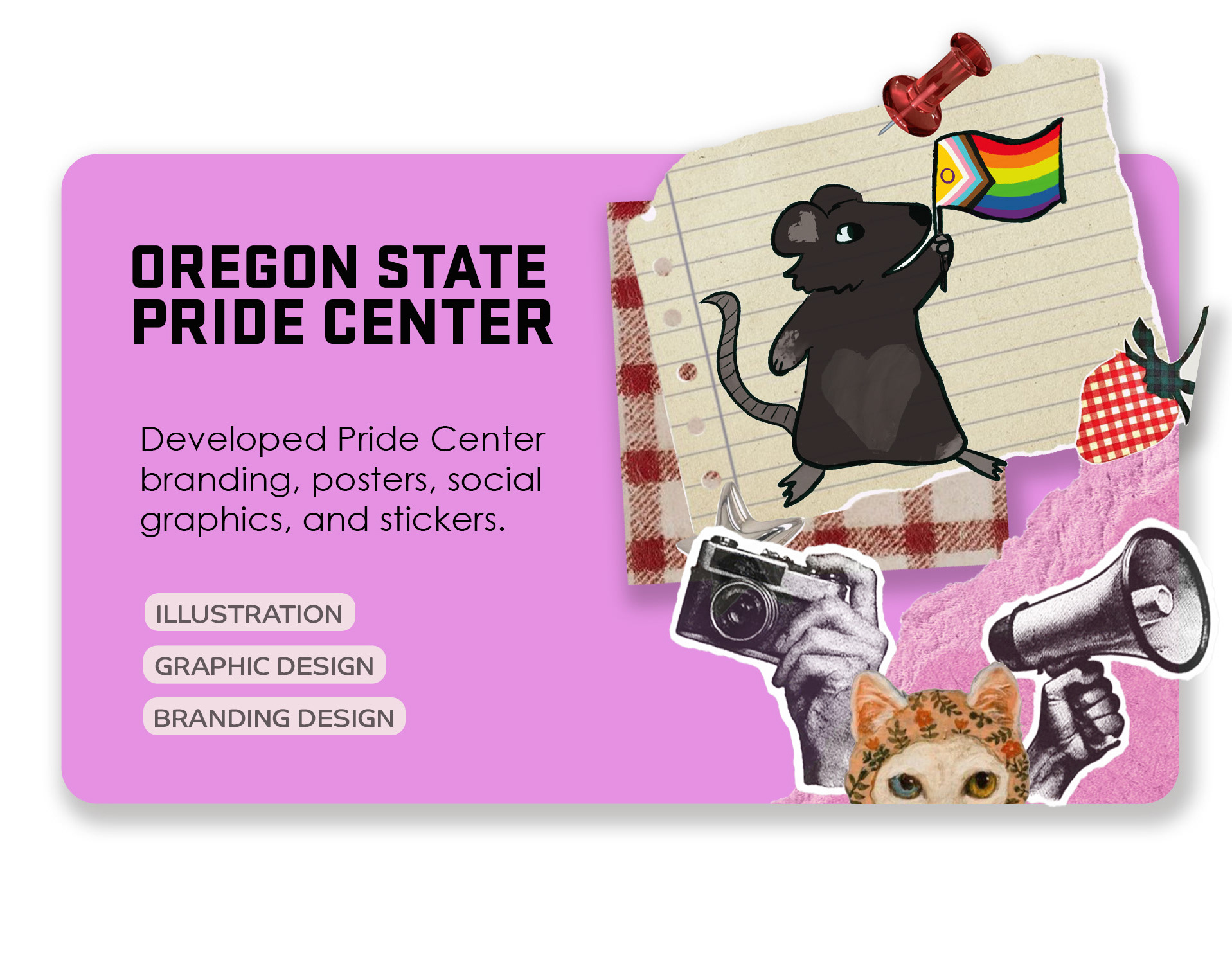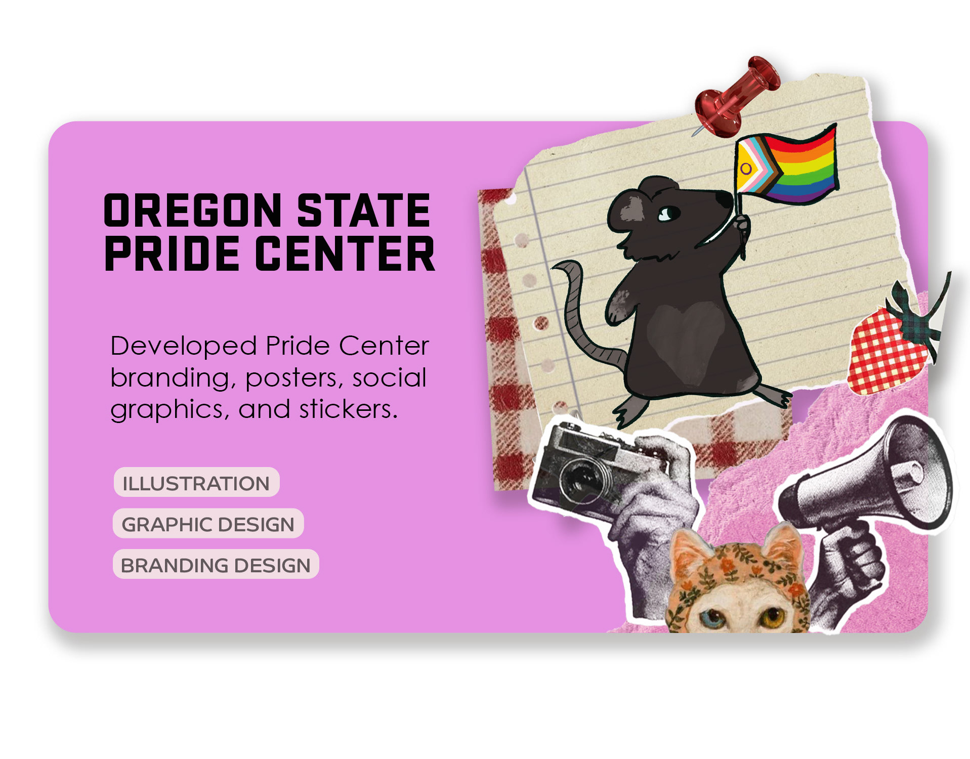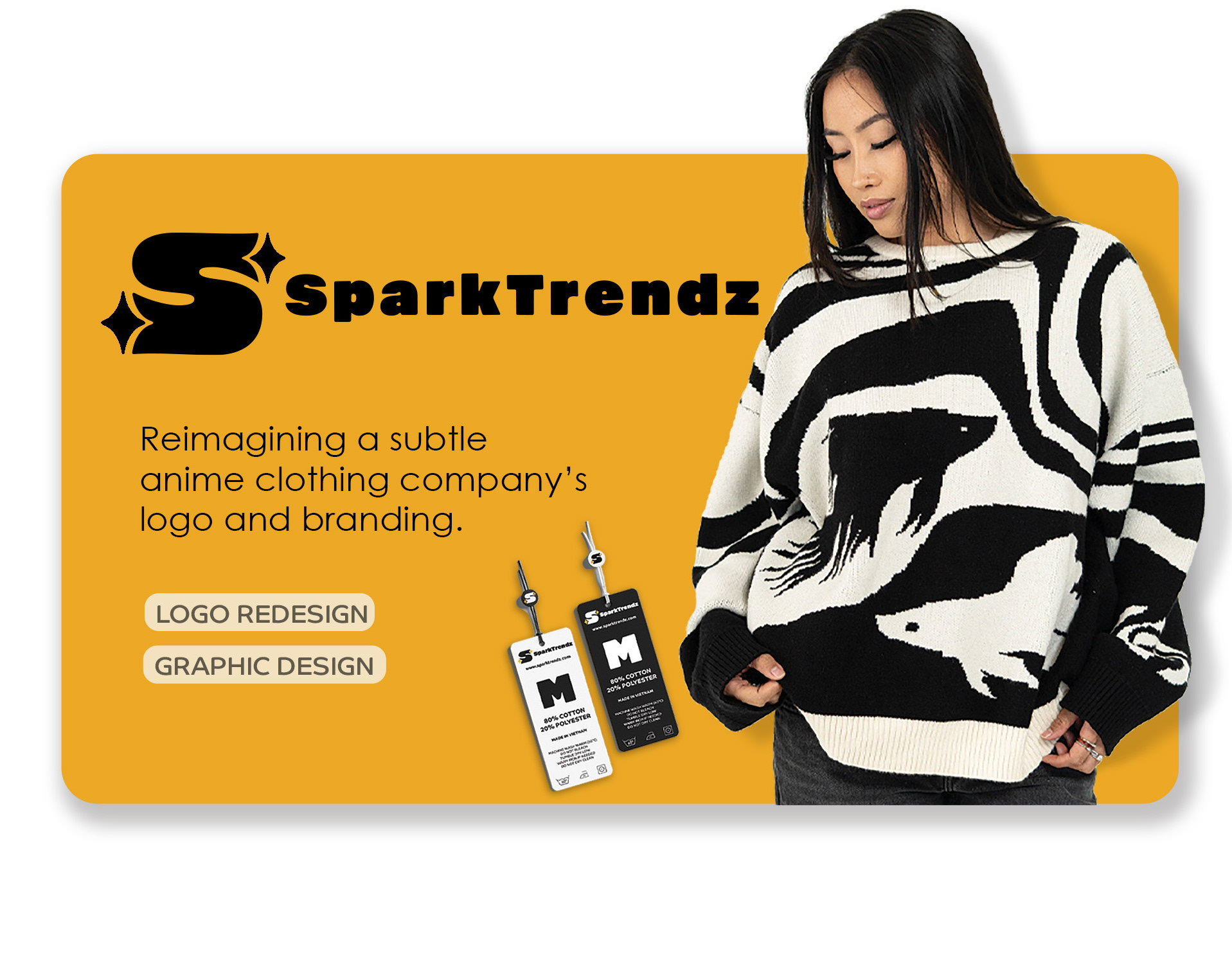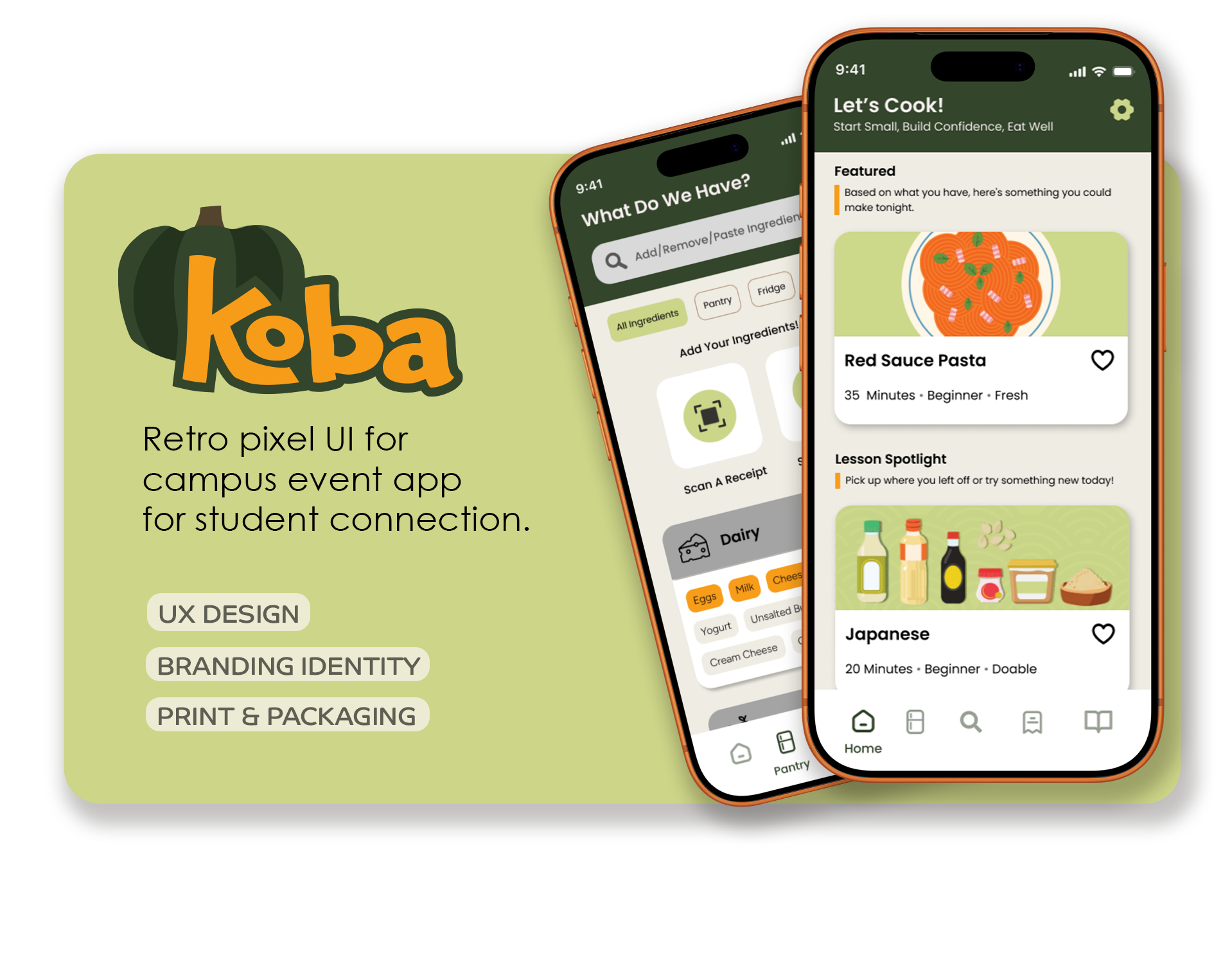

Project Overview
LSAMP OSU had established recognition within the campus community. While the program’s funding and name changed, its mission and values remained consistent. The new identity needed to honor that history without feeling disconnected from its past.
ROOTS is a STEM-focused program at Oregon State University dedicated to increasing student success through academic preparation and community building. Following a funding shift, the program transitioned from its former name to ROOTS — an acronym for Reaching Out Opportunities Throughout STEM. While the mission remained consistent, the identity required thoughtful evolution to reflect the new name and renewed direction.
Role:
Creative Director
Graphic Designer
Services:
Brand Ideation
User Research
Logo Design
The Challenge:
The program previously had a logo under its former name that was well-received within the community. After the name change, a temporary logo was generated quickly using AI, but it lacked refinement, scalability, and a strong typographic structure. The visual relied heavily on literal root imagery without a clear hierarchy, making it feel more decorative than strategic. The team needed an identity that felt grounded, professional, and aligned with the program's academic credibility while still honoring the familiarity of the past.
Research:
After interviewing students and staff, my team mate and I found that there was a strong sense of connection and almost a family sense in this program. We wanted to touch on that rather than the more literal interpretation of roots in their final logo. We asked about their memories in the program from the start to now. We also ask what types of things they thought about when they are asked about the programming, ranging from color, smell, sound, and feelings. From that, we gained a lot of insight into what the program truly means to the students who participate in it.
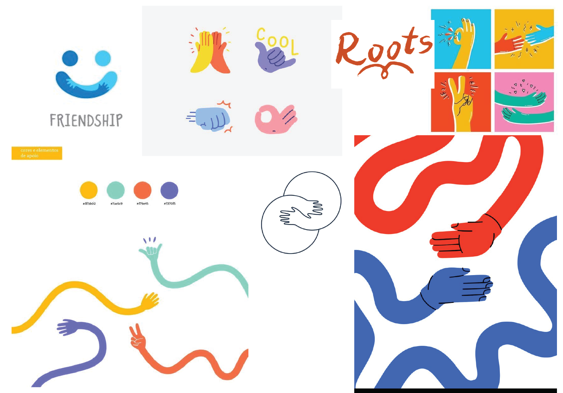
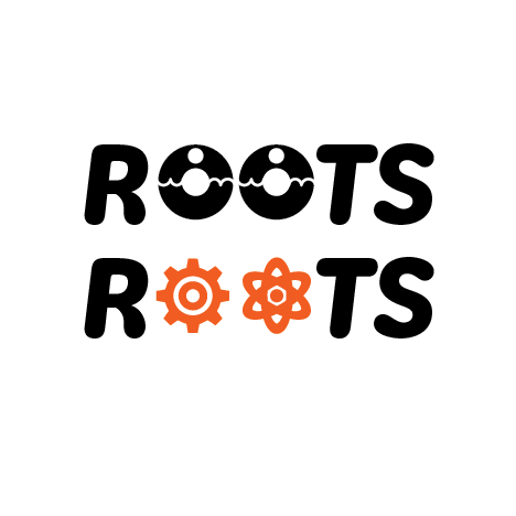
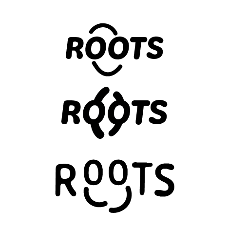
Mood Board (and a sketch!)
Sketches:
Connection
Connection
infinity
Hands toghether
Hugs / Science
Hug / Closeness
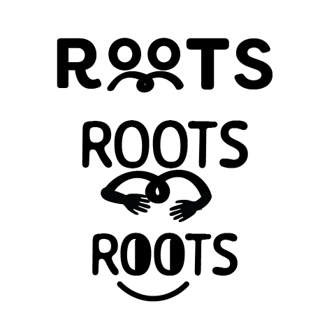
Friends
Hugs
Family / Friends
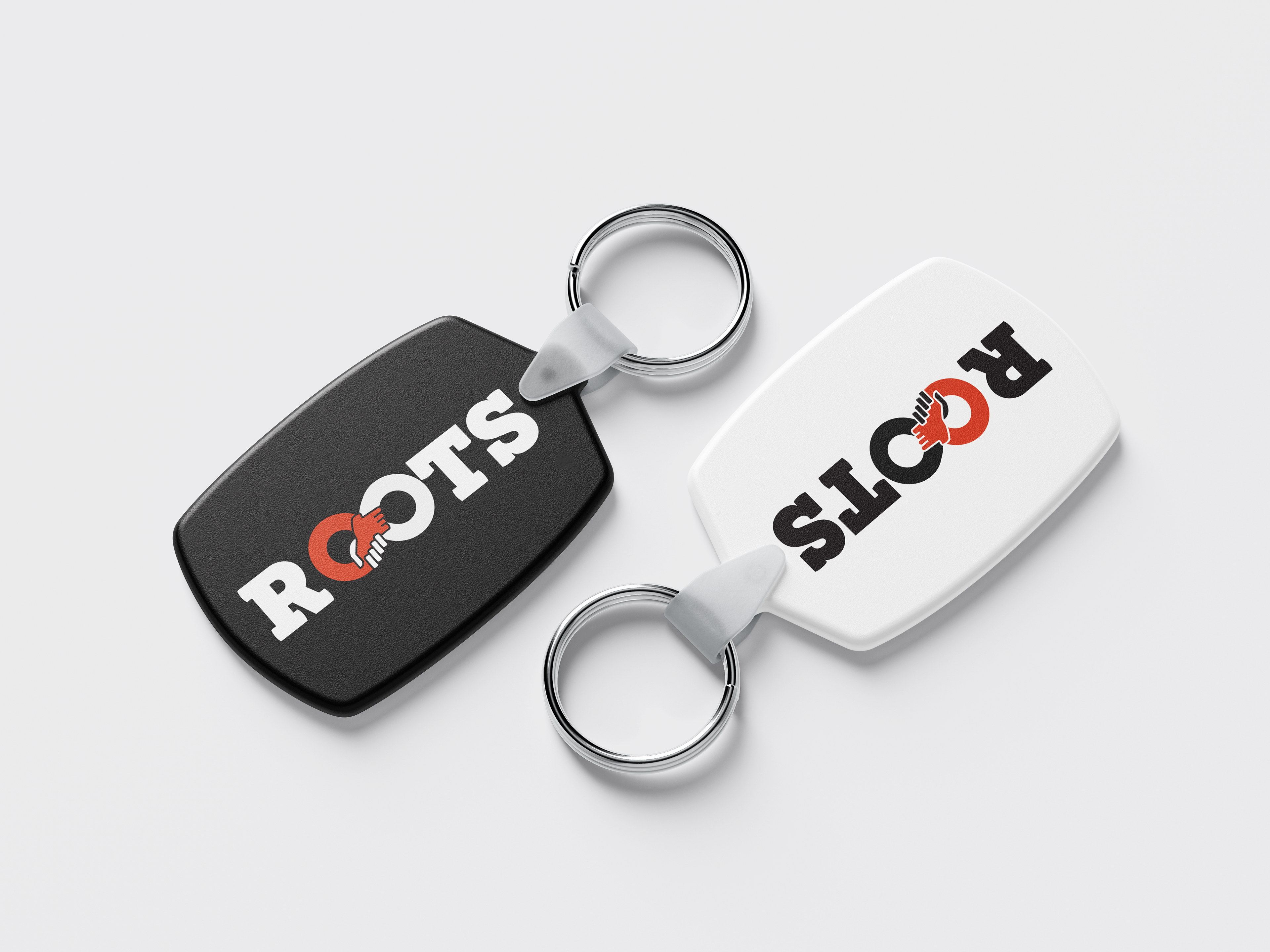
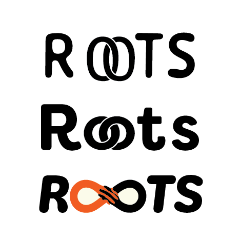
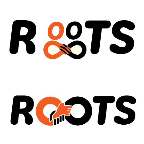
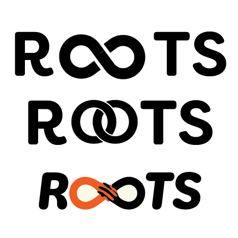
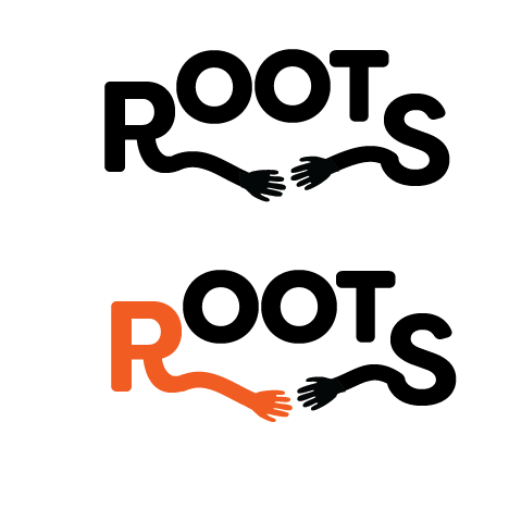
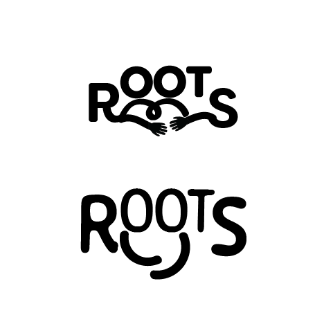
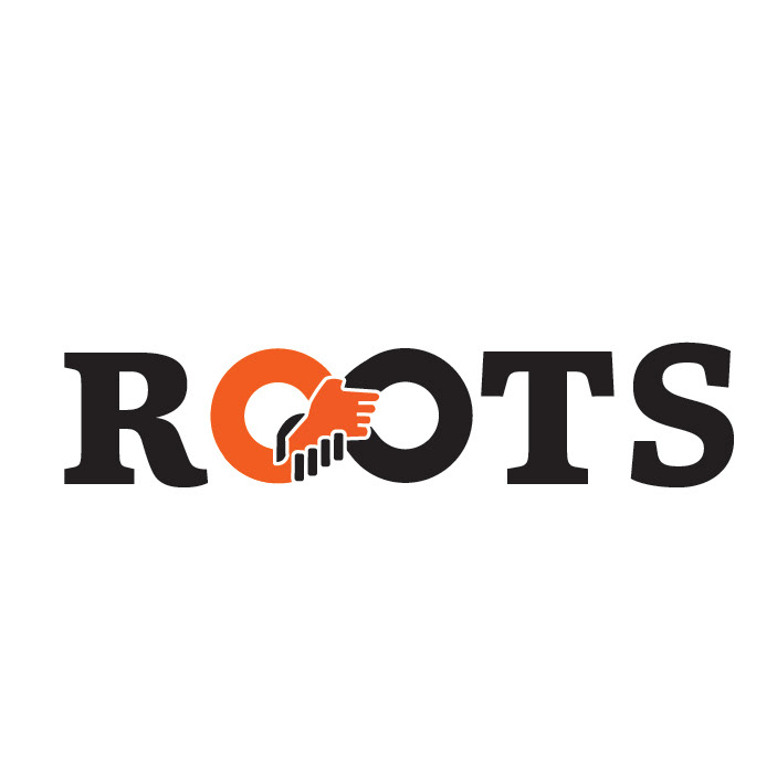
The Concept:
Hands holding symbolize connection while maintaining the program’s original style with a refreshed look.

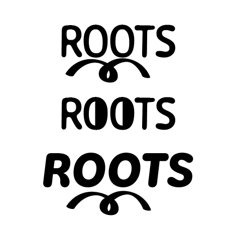
Variant 1

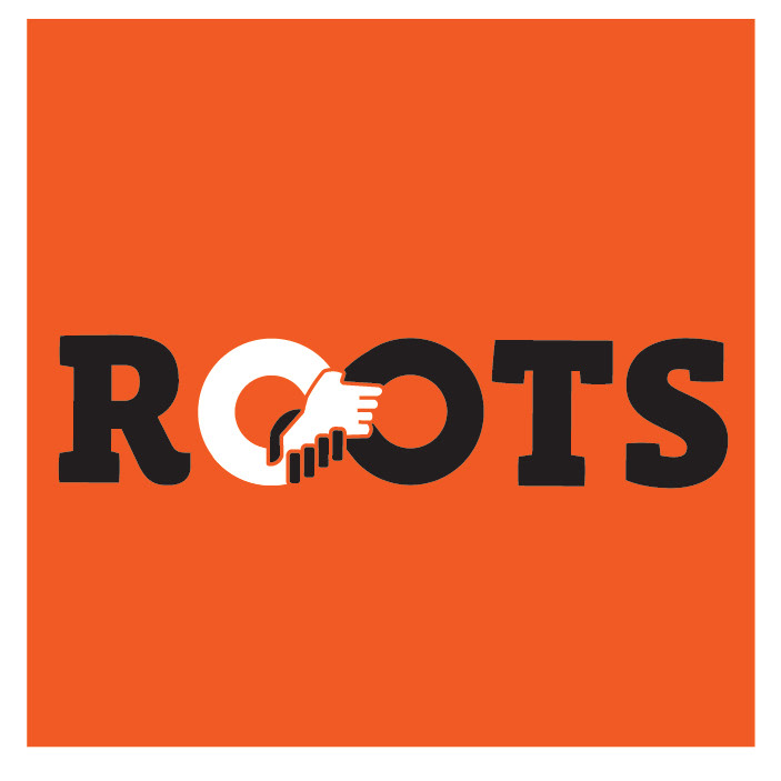
Variant 2 (with dark background)
Variant 3
Variant 4

Variant 5
Variant 6
The Outcome:
The final identity successfully bridges the program’s past and future. It retains the symbolic meaning behind “ROOTS” while elevating the visual execution to feel cohesive and institutionally appropriate. By transforming a temporary placeholder into a strategic, polished mark, the redesign reinforces the program’s credibility and provides a sustainable foundation for long-term use.

Black Background (Primary)
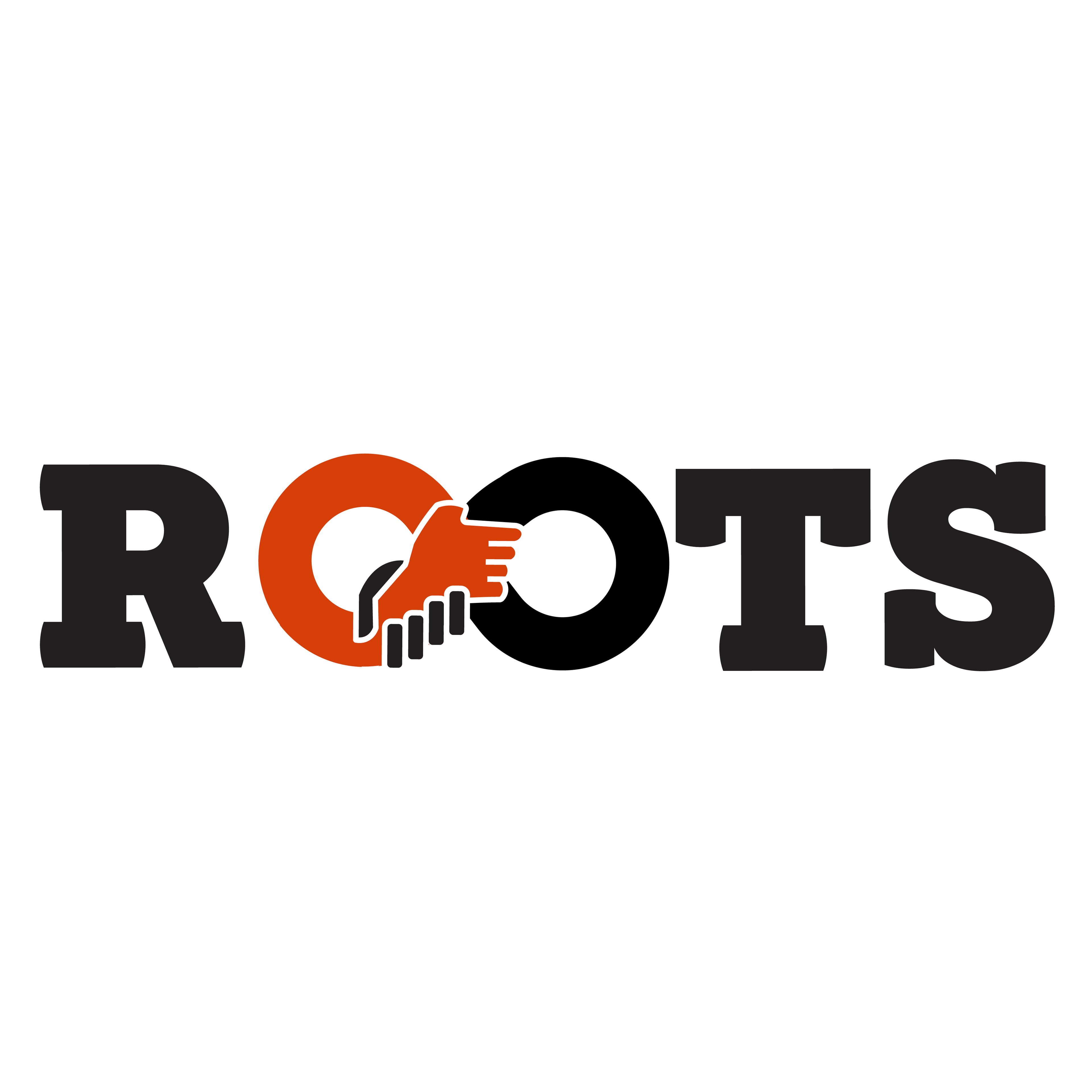
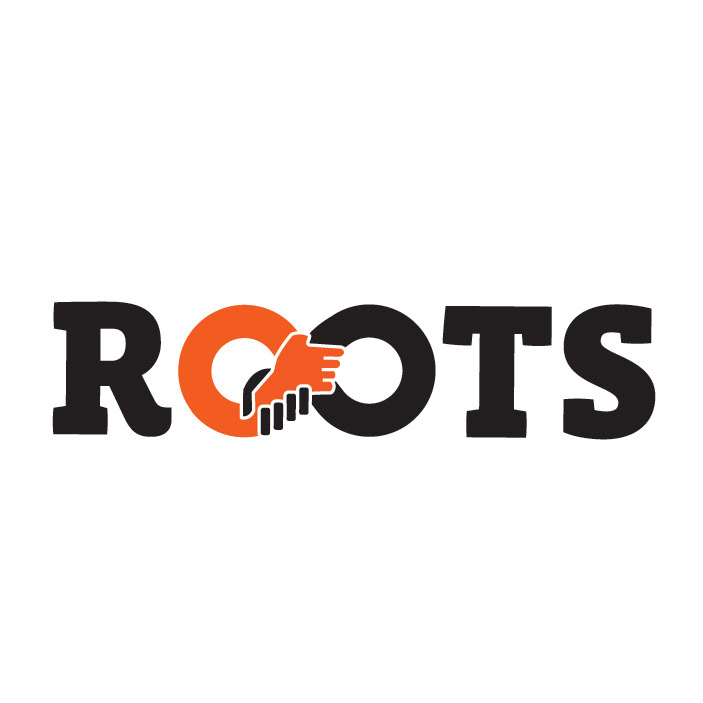
White Background (Alternative)