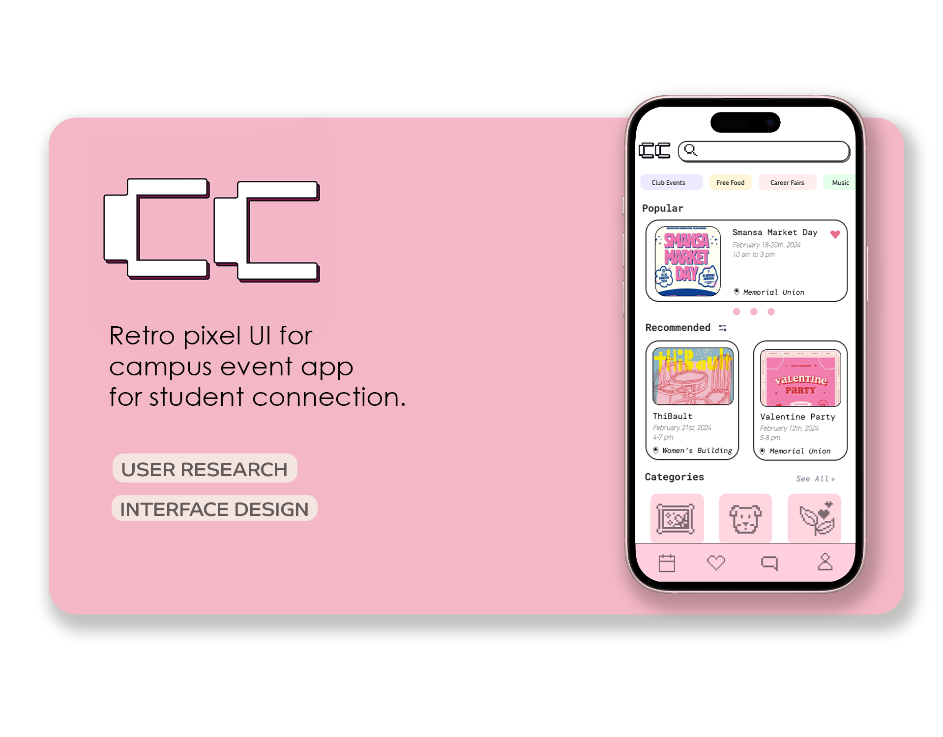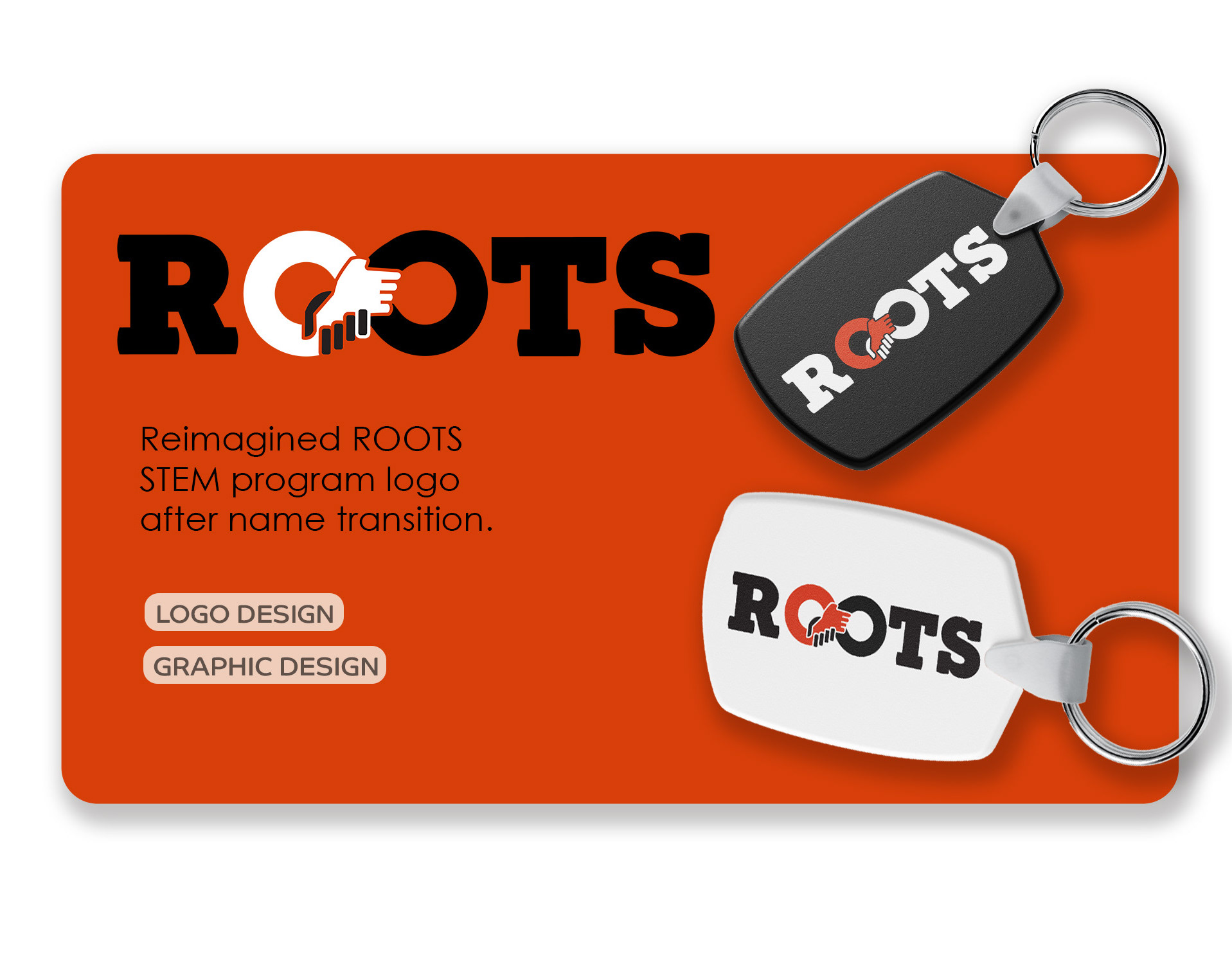

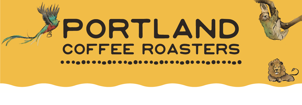
Project Overview
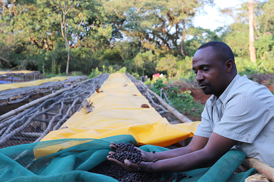
Portland Coffee Roasters is a Pacific Northwest coffee company known for its commitment to ethical sourcing and strong relationships with coffee-growing regions around the world. This project explores how packaging design can highlight the cultural origins of coffee while maintaining a cohesive and recognizable visual system for the brand.
The Challenge:
Portland Coffee Roasters emphasizes ethical sourcing and strong relationships with coffee-growing regions. The challenge was to create packaging illustrations that celebrate the origins of the coffee while visually connecting customers to the cultures and landscapes behind each roast.
Process:
I researched into each country’s national symbolism and flag colors informed the illustrations and palette choices. Sketch exploration and digital illustration were used to develop animals that felt expressive while remaining clean and adaptable for packaging.
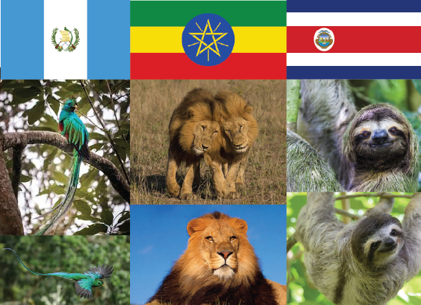
Moodboard
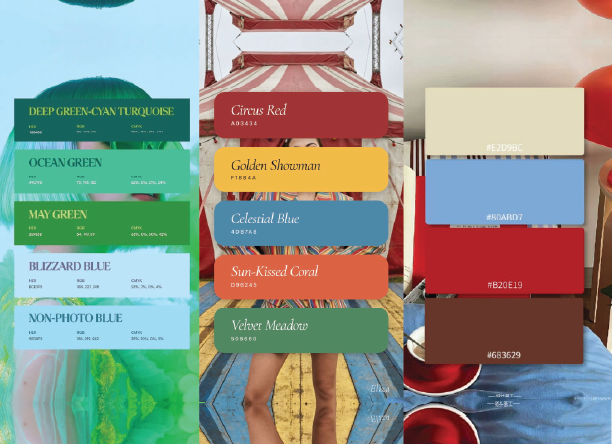
Color Palette
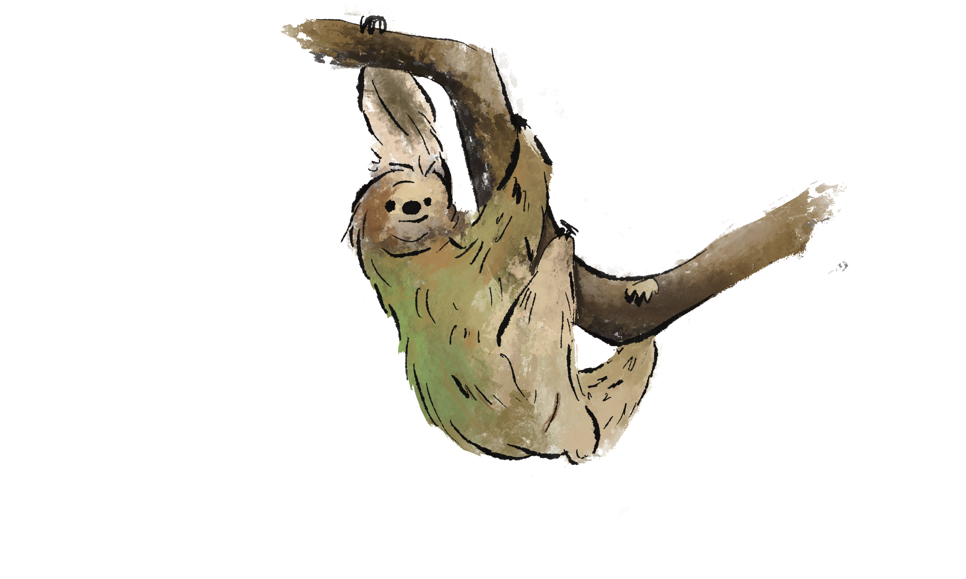
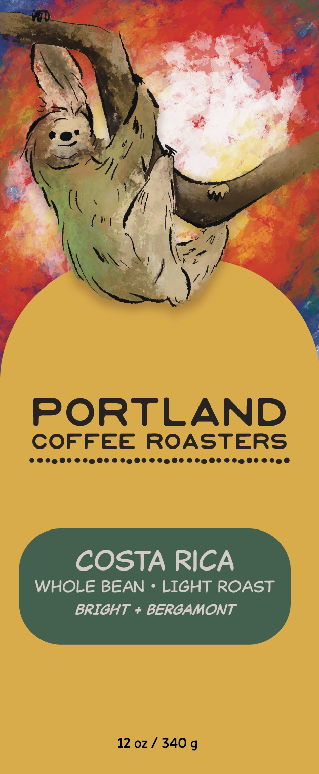
Sloth
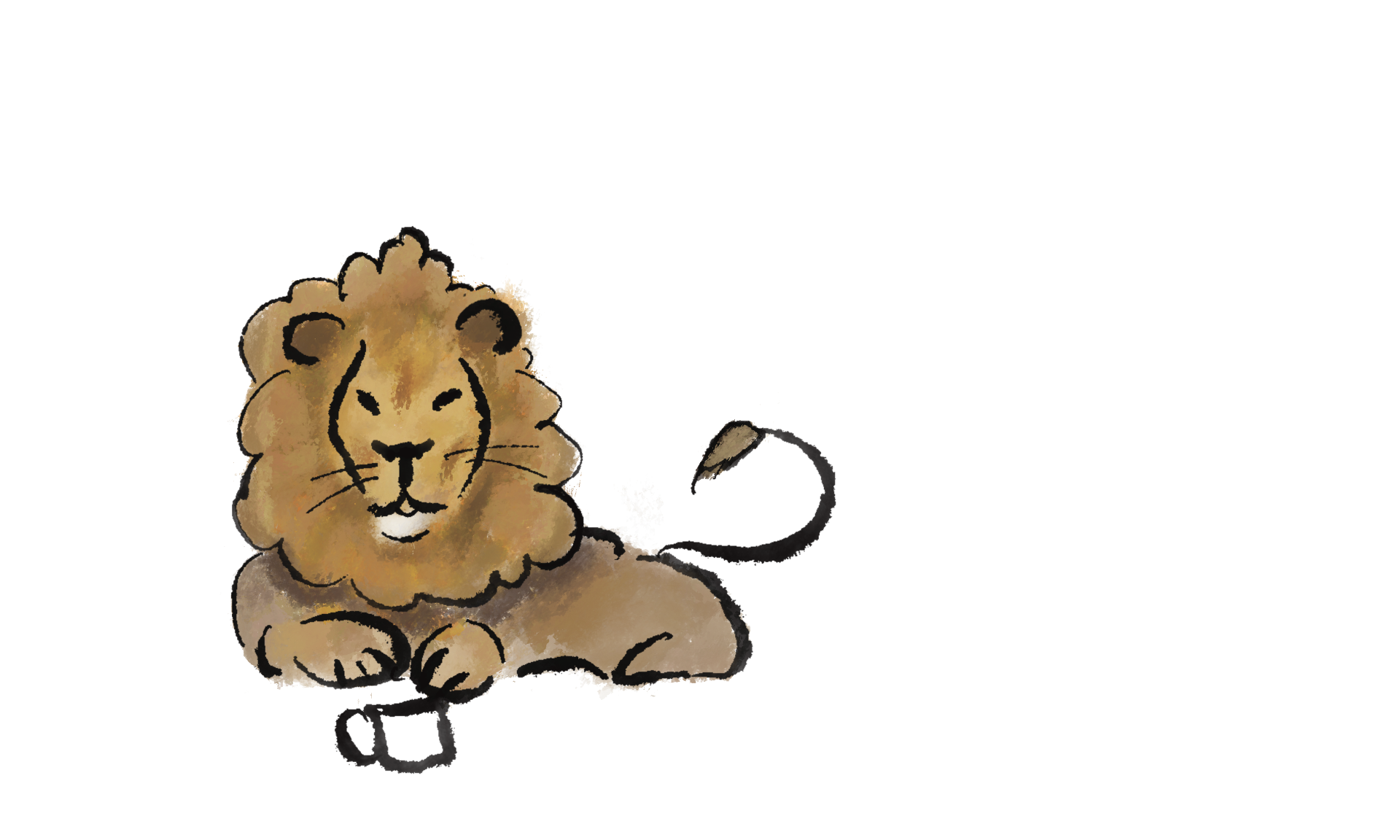
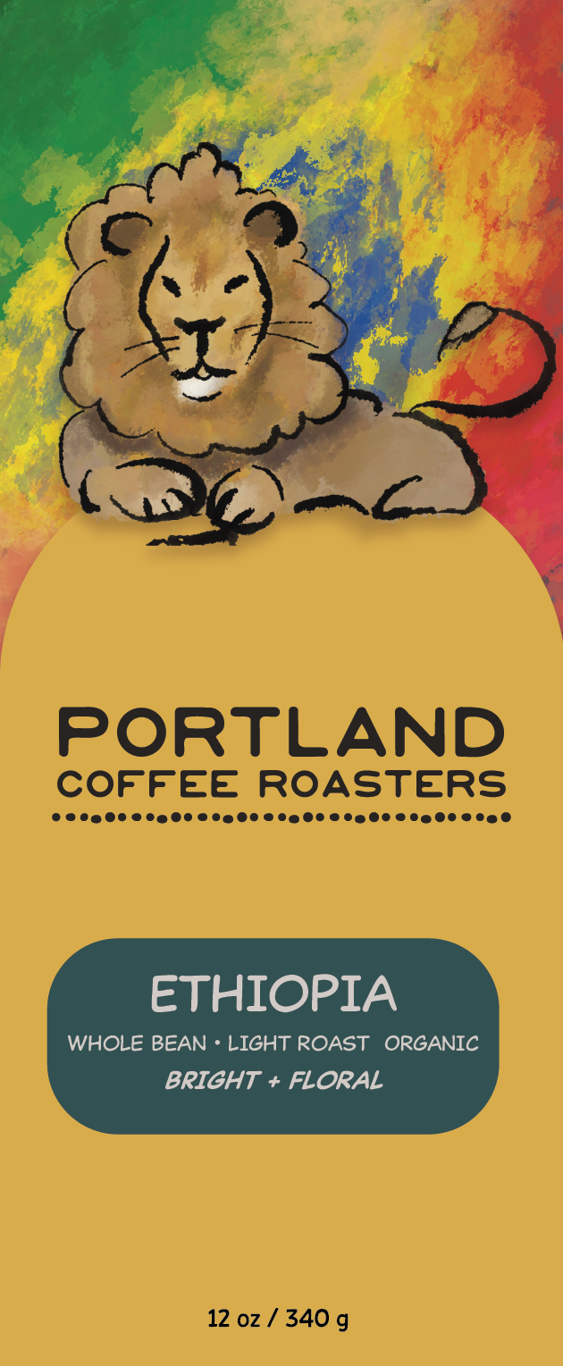
Lion
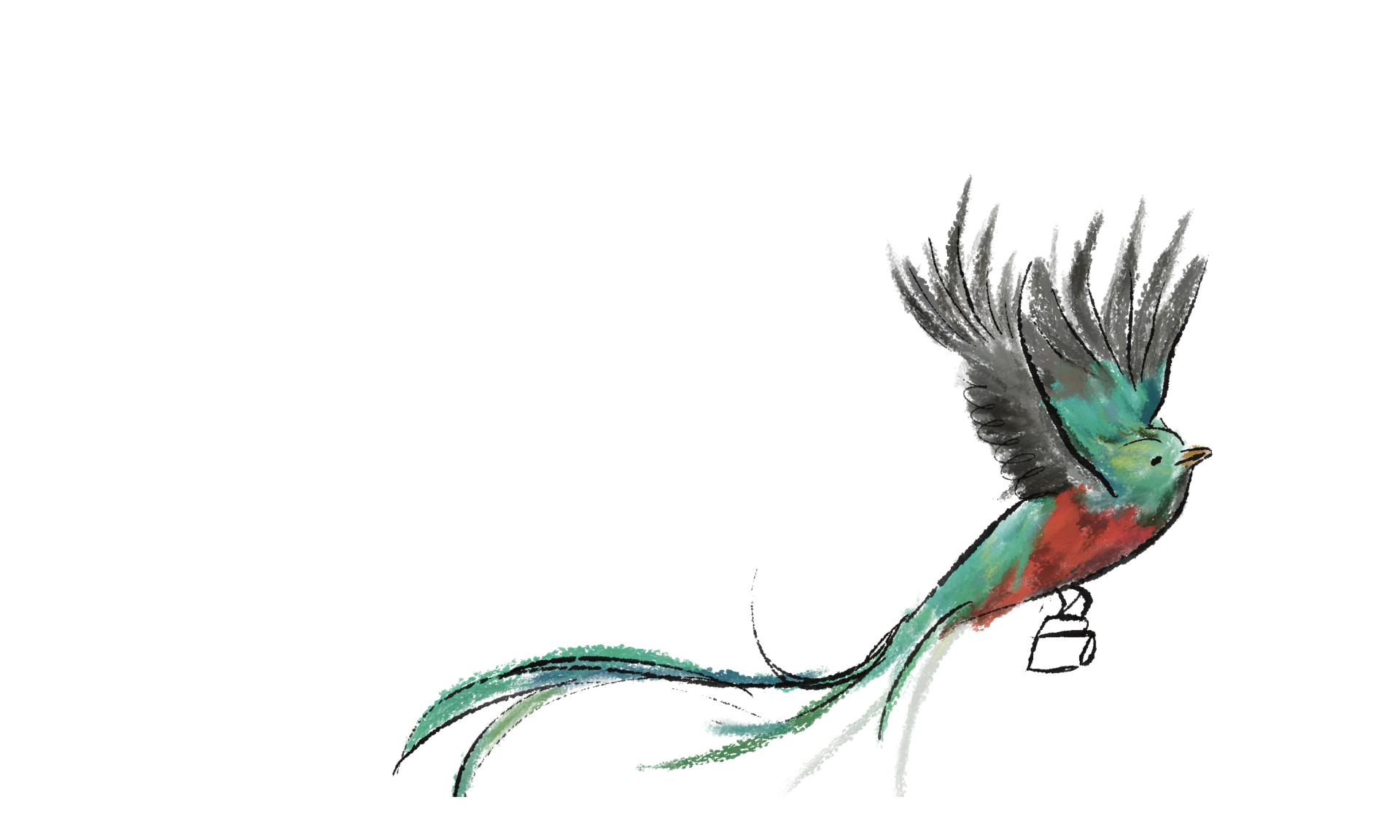
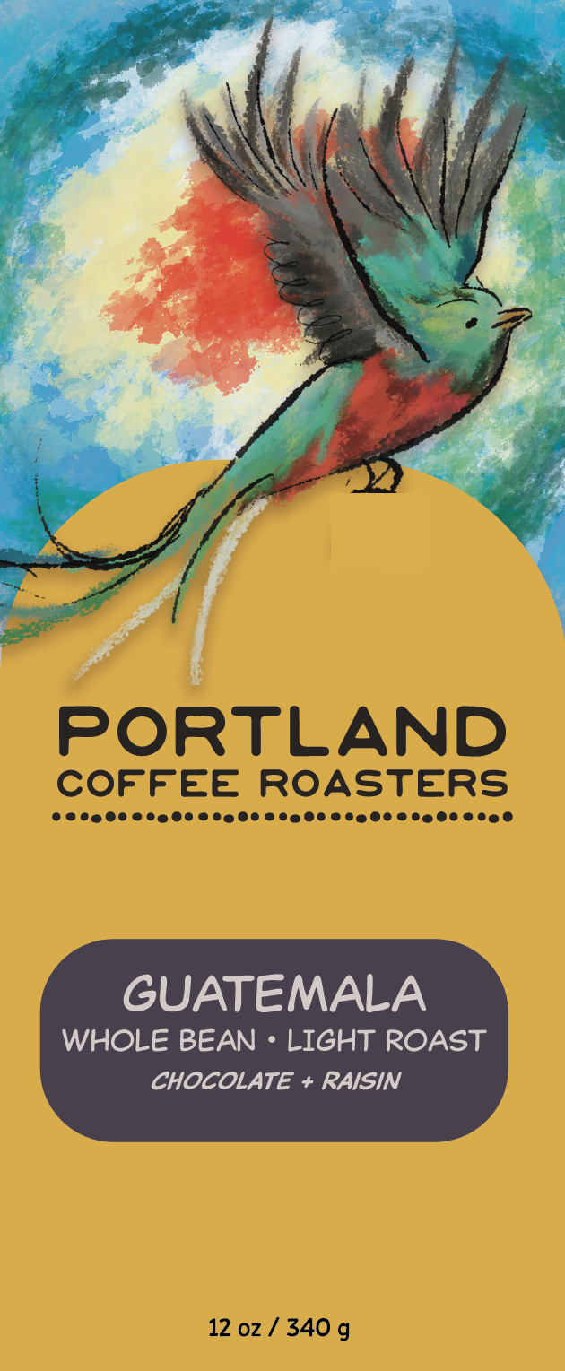
Resplendent Quetzal
Concept:
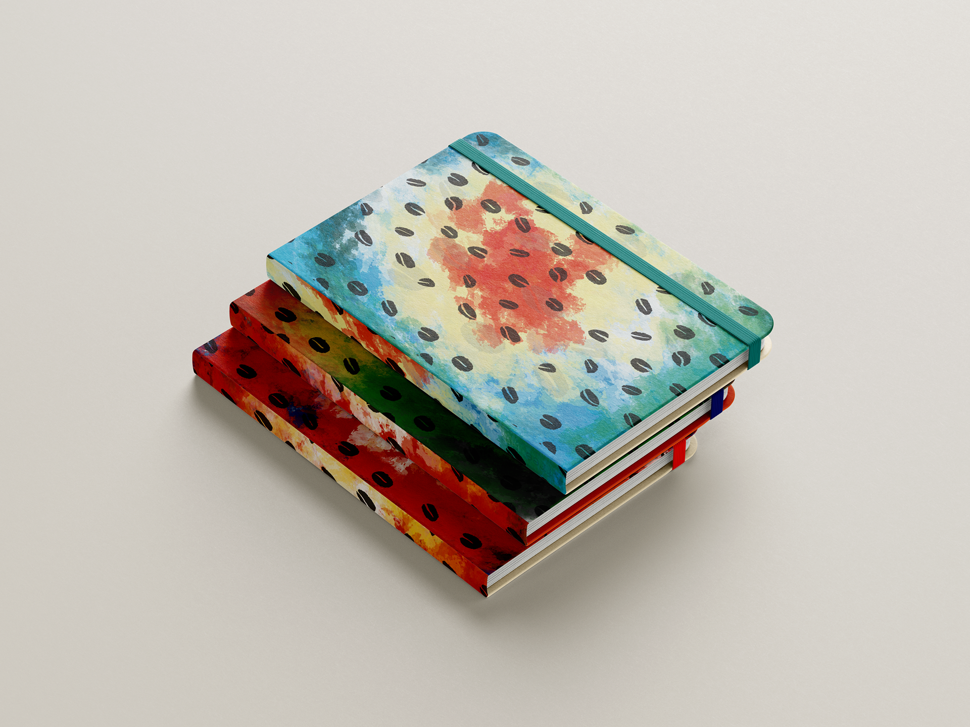
Each coffee variety features an illustration of the country’s national animal paired with colors inspired by the national flag. These visual elements act as storytelling devices, connecting the coffee to its place of origin and emphasizing the global journey of the beans. The illustrations create personality for each roast while maintaining consistency across the packaging series.
Final 3 Concepts:
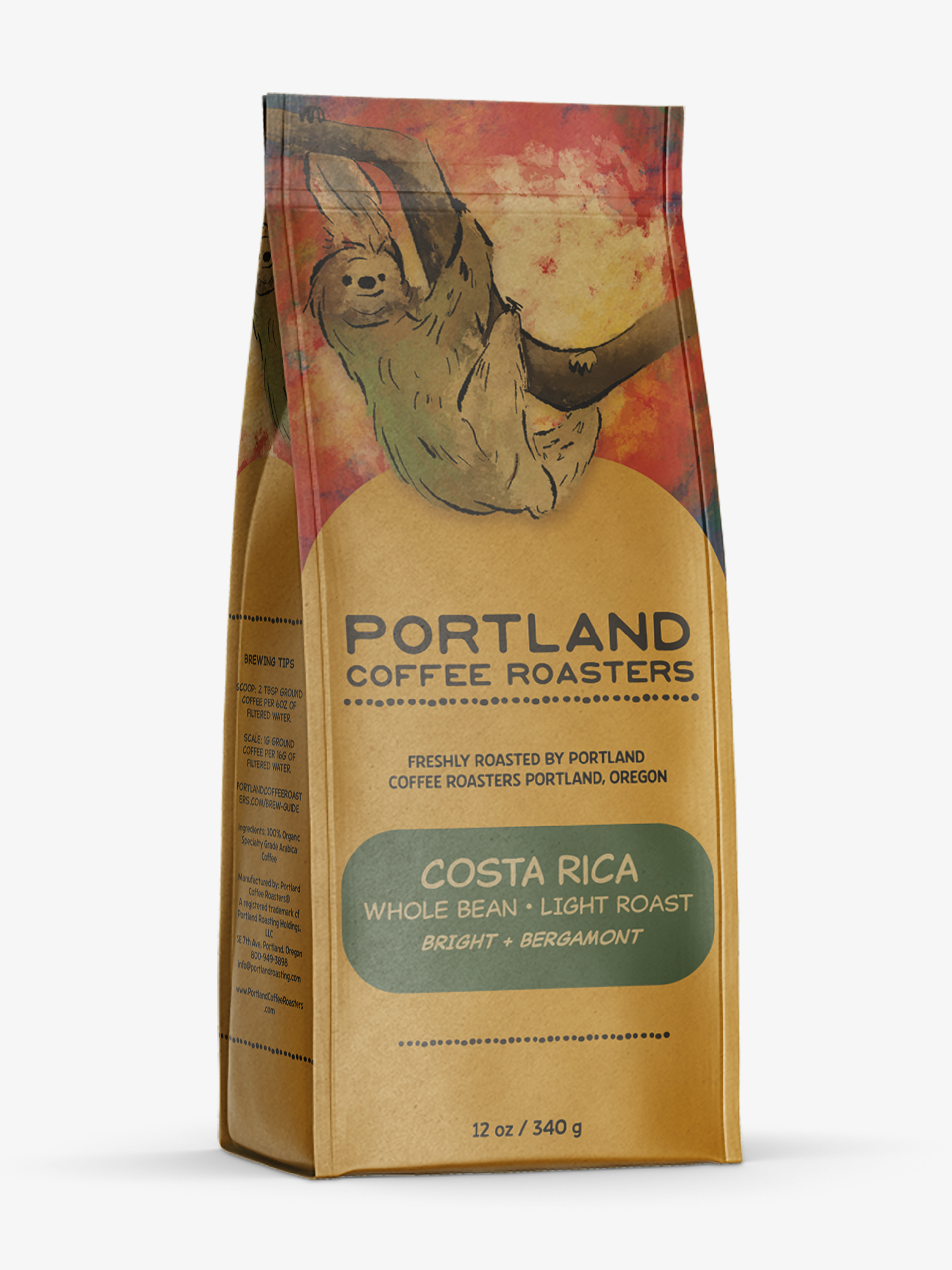
Costa Rica
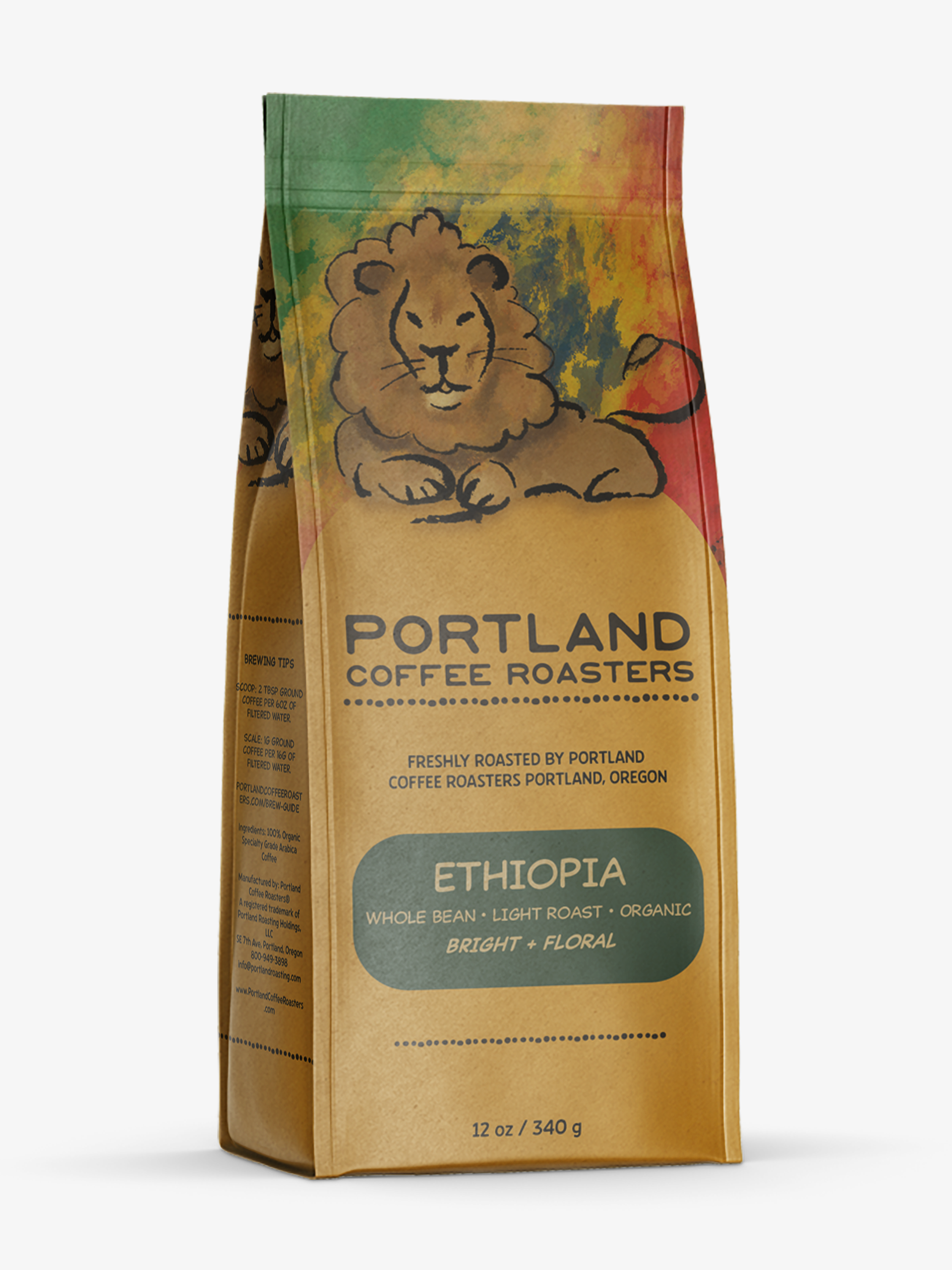
Ethiopia
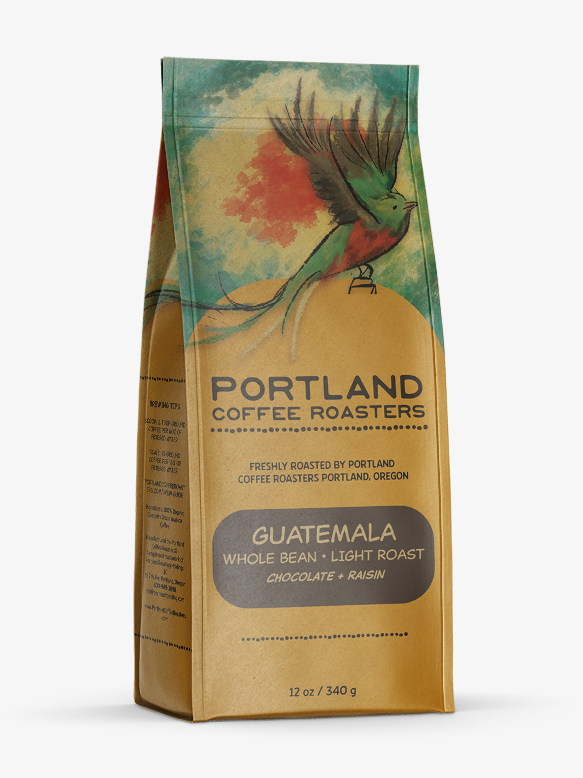
Guatemala
Final Outcome:
The final packaging series includes designs for Costa Rica, Ethiopia, and Guatemala coffees. The use of national animals and flag-inspired color palettes creates a visually engaging system that highlights the beans' origins while reinforcing Portland Coffee Roasters’ values of transparency and ethical sourcing.
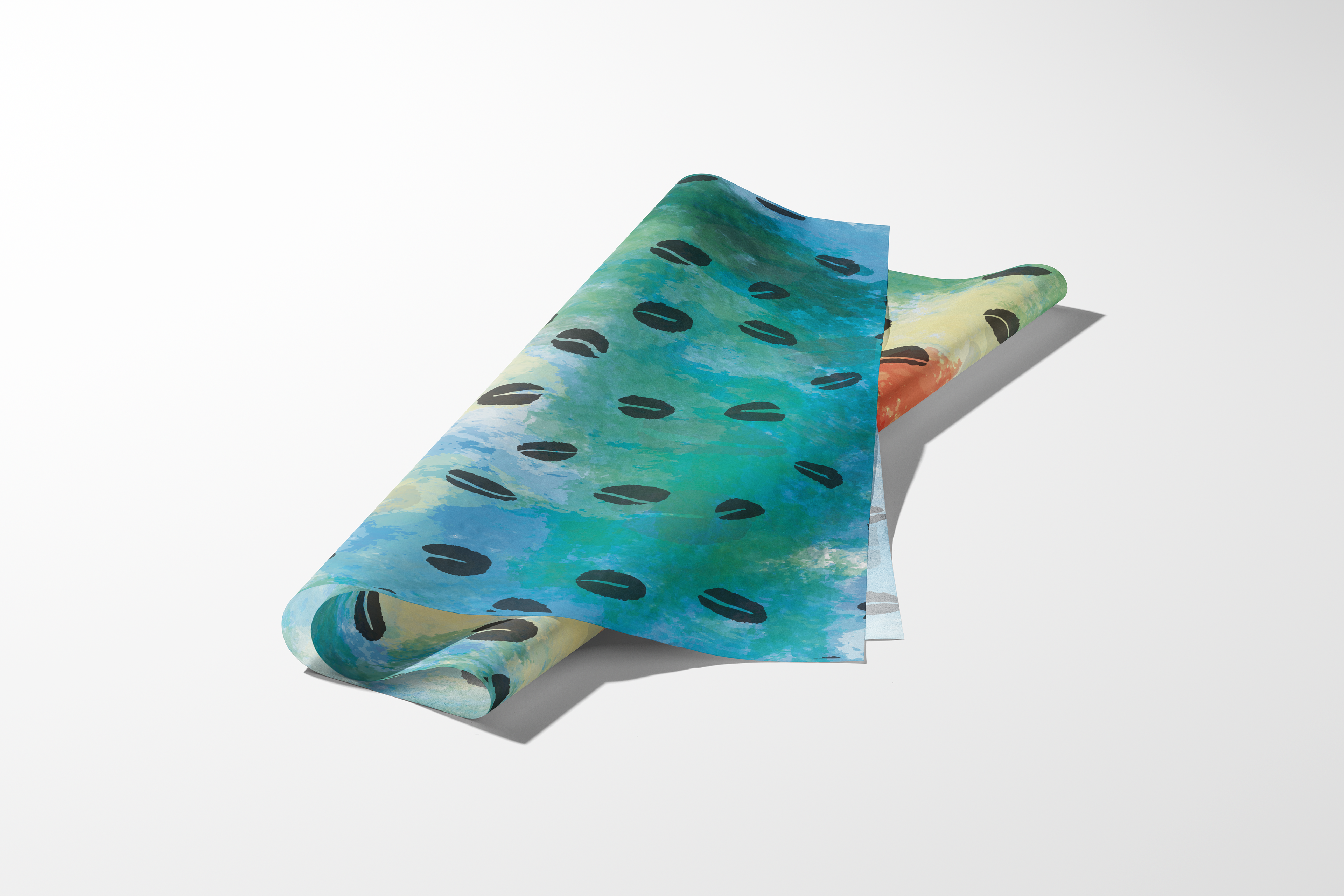
Packaging Tissue