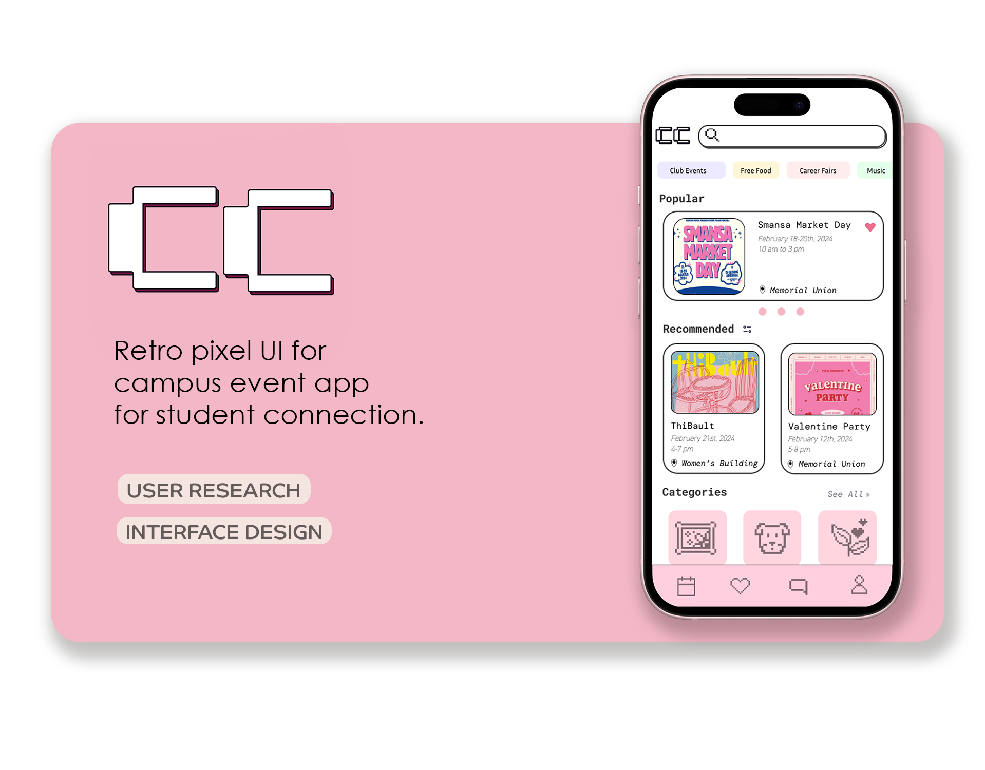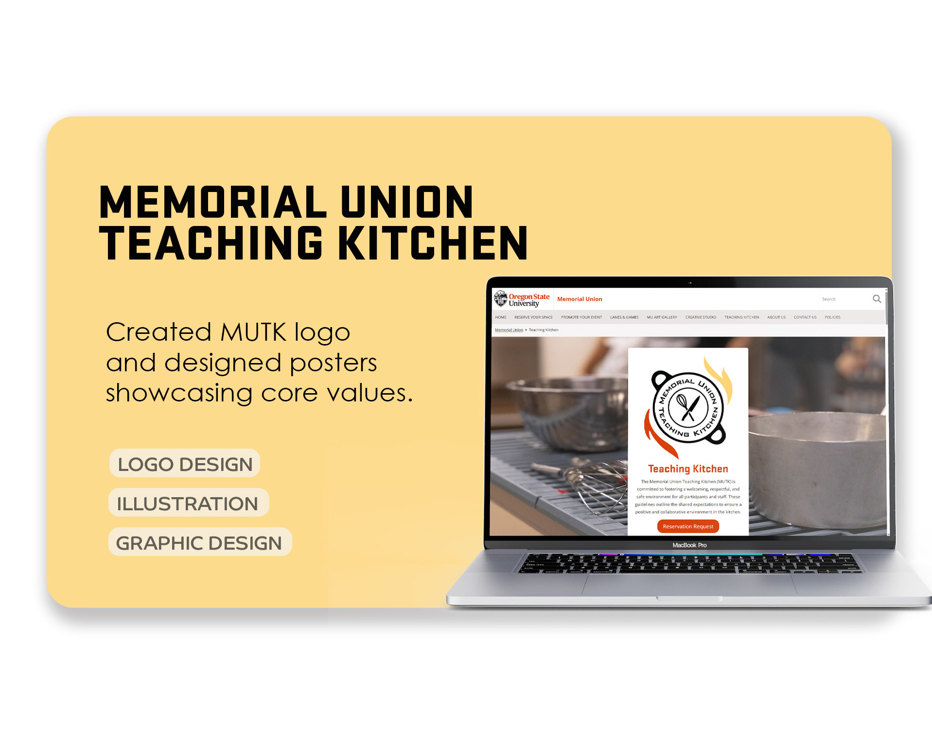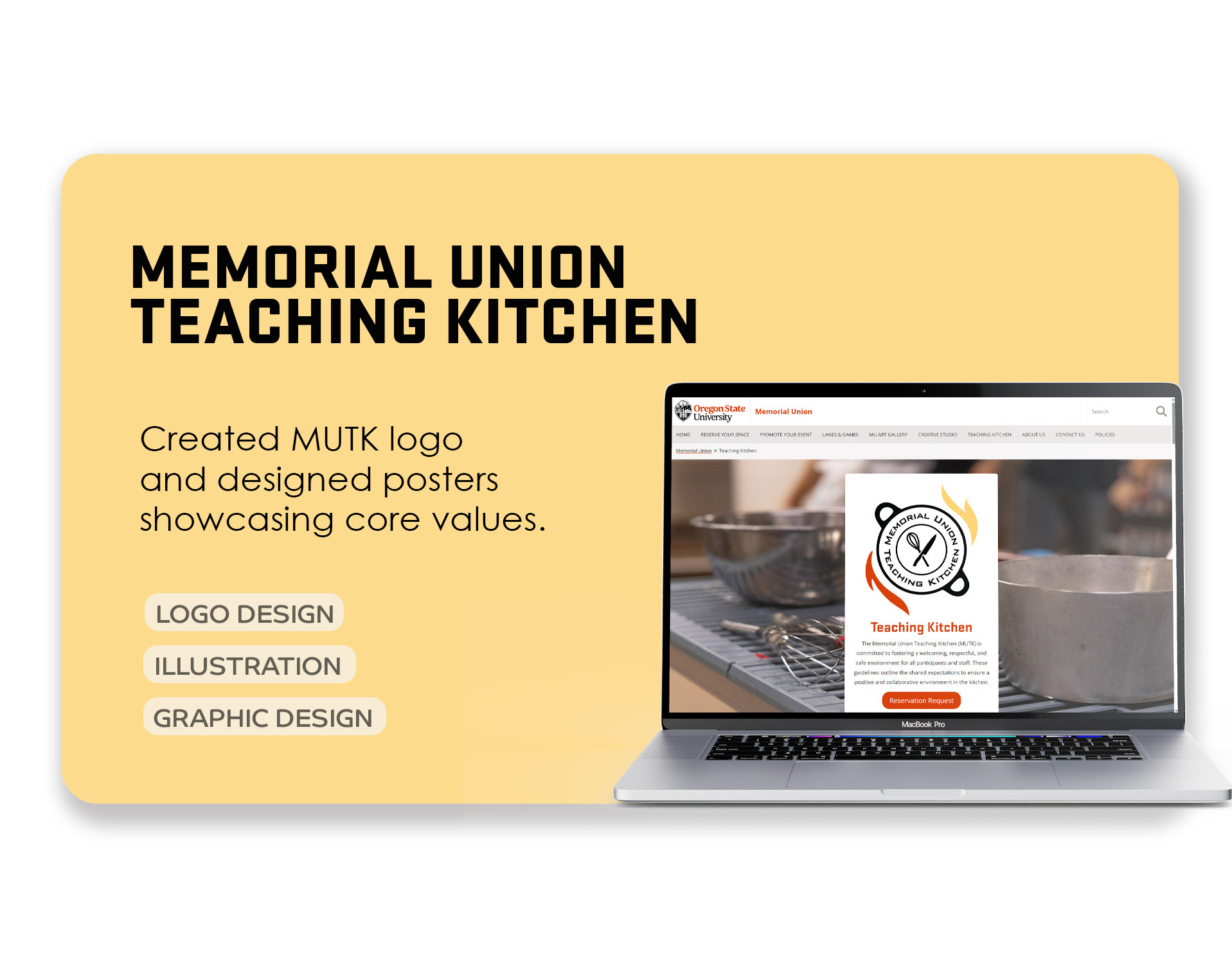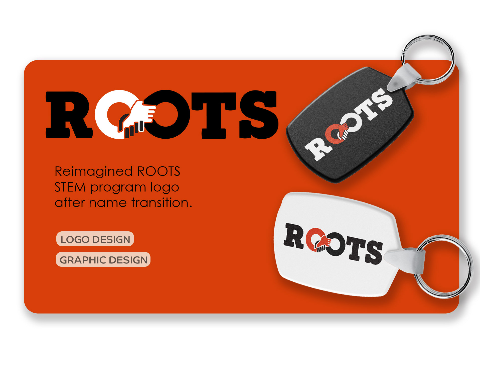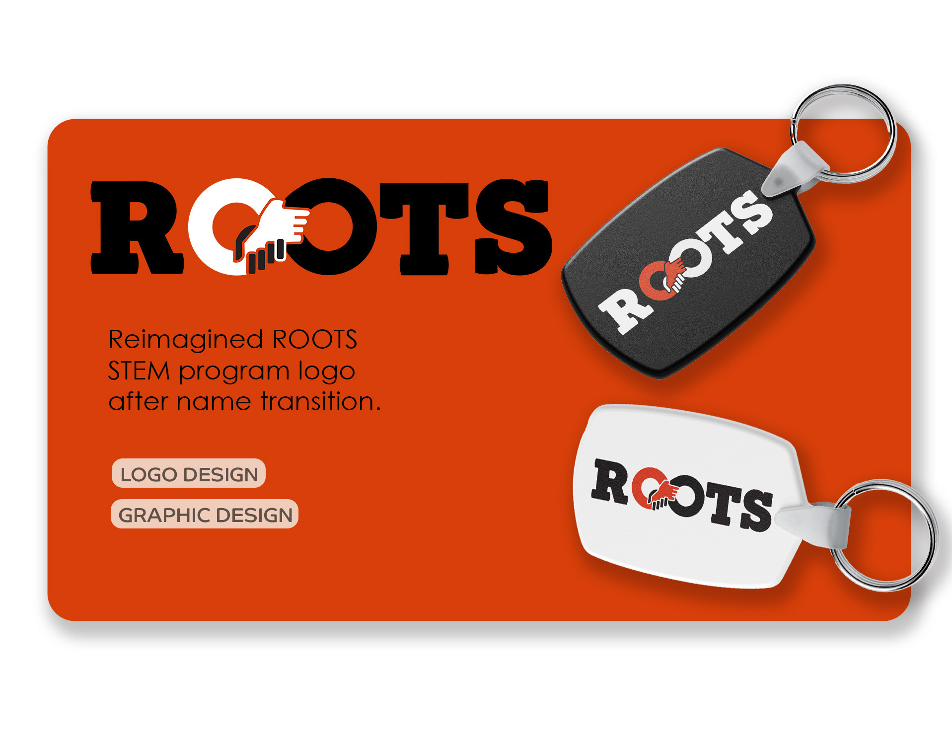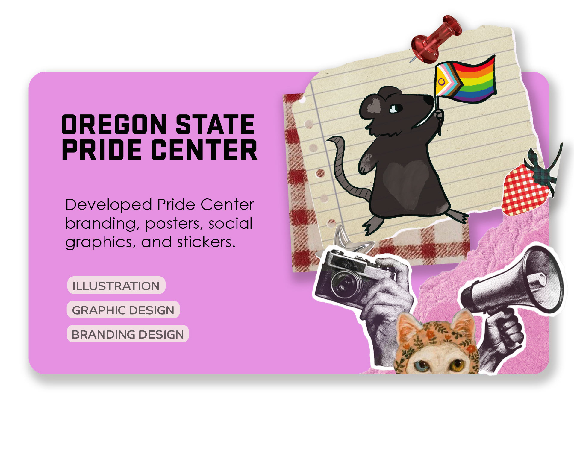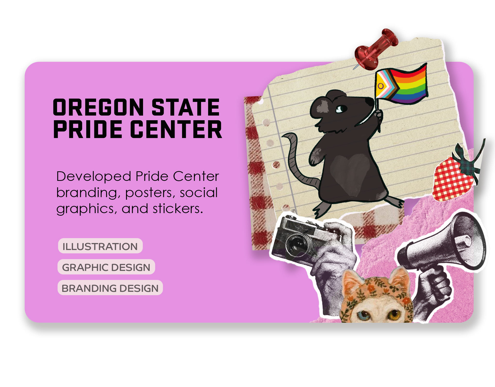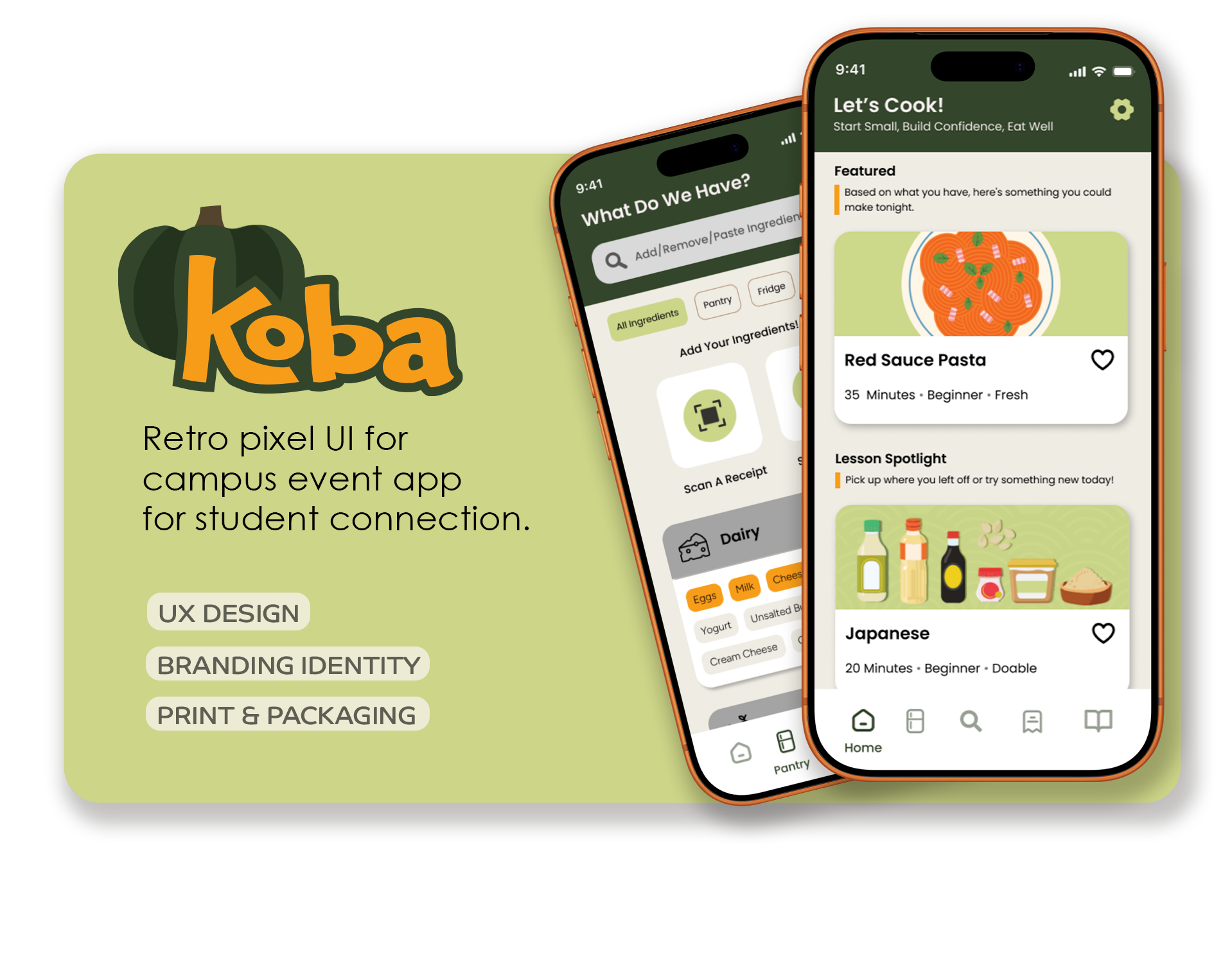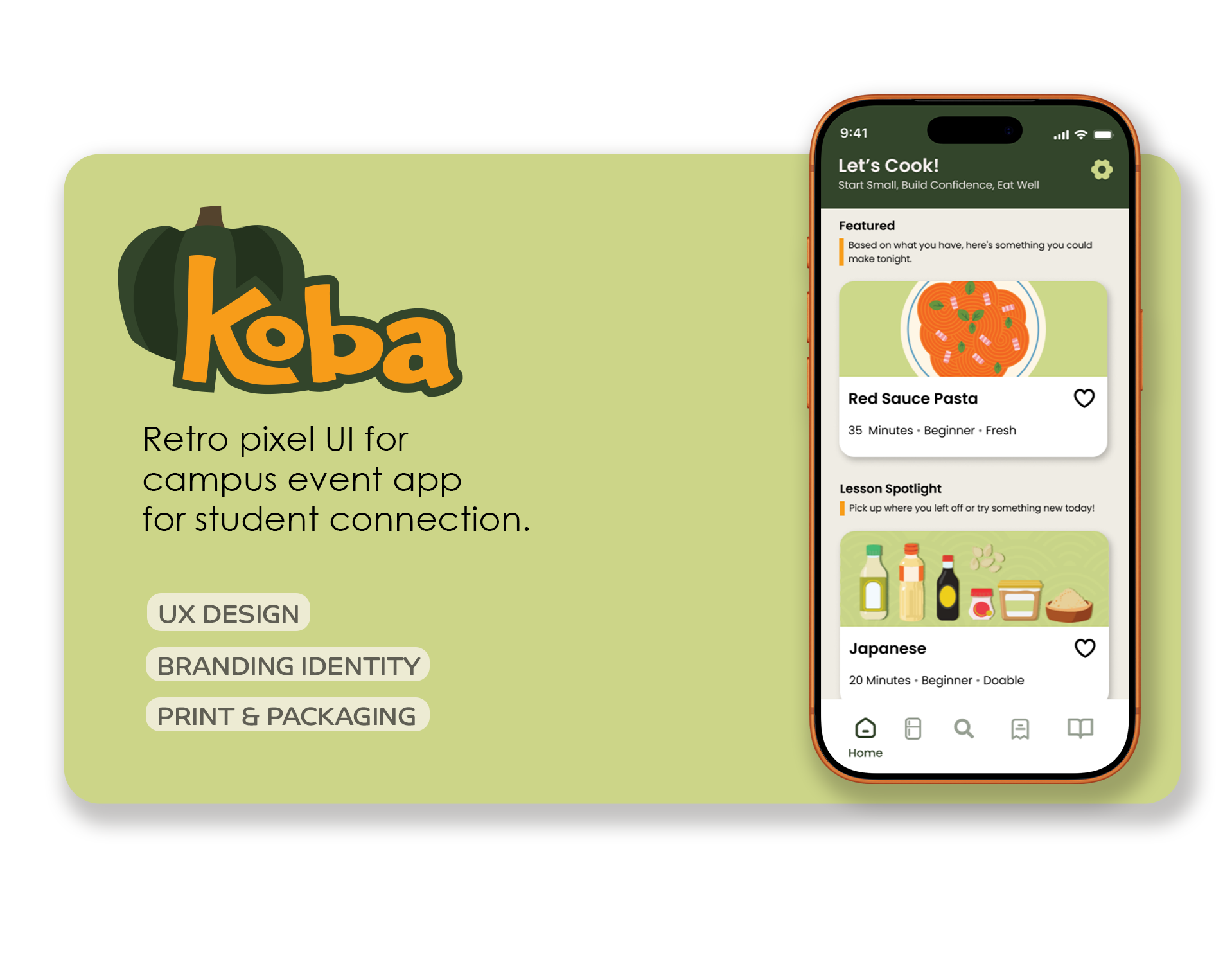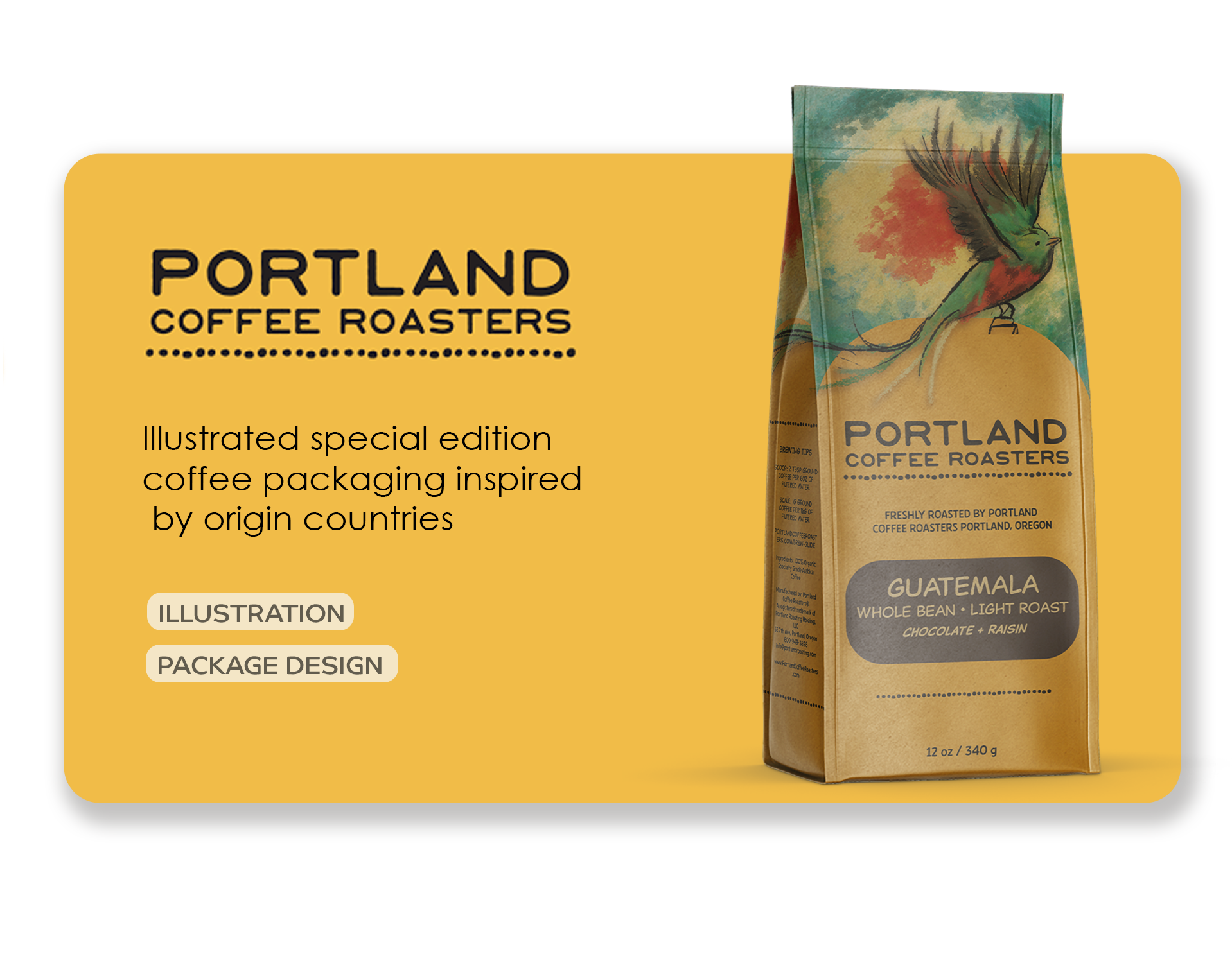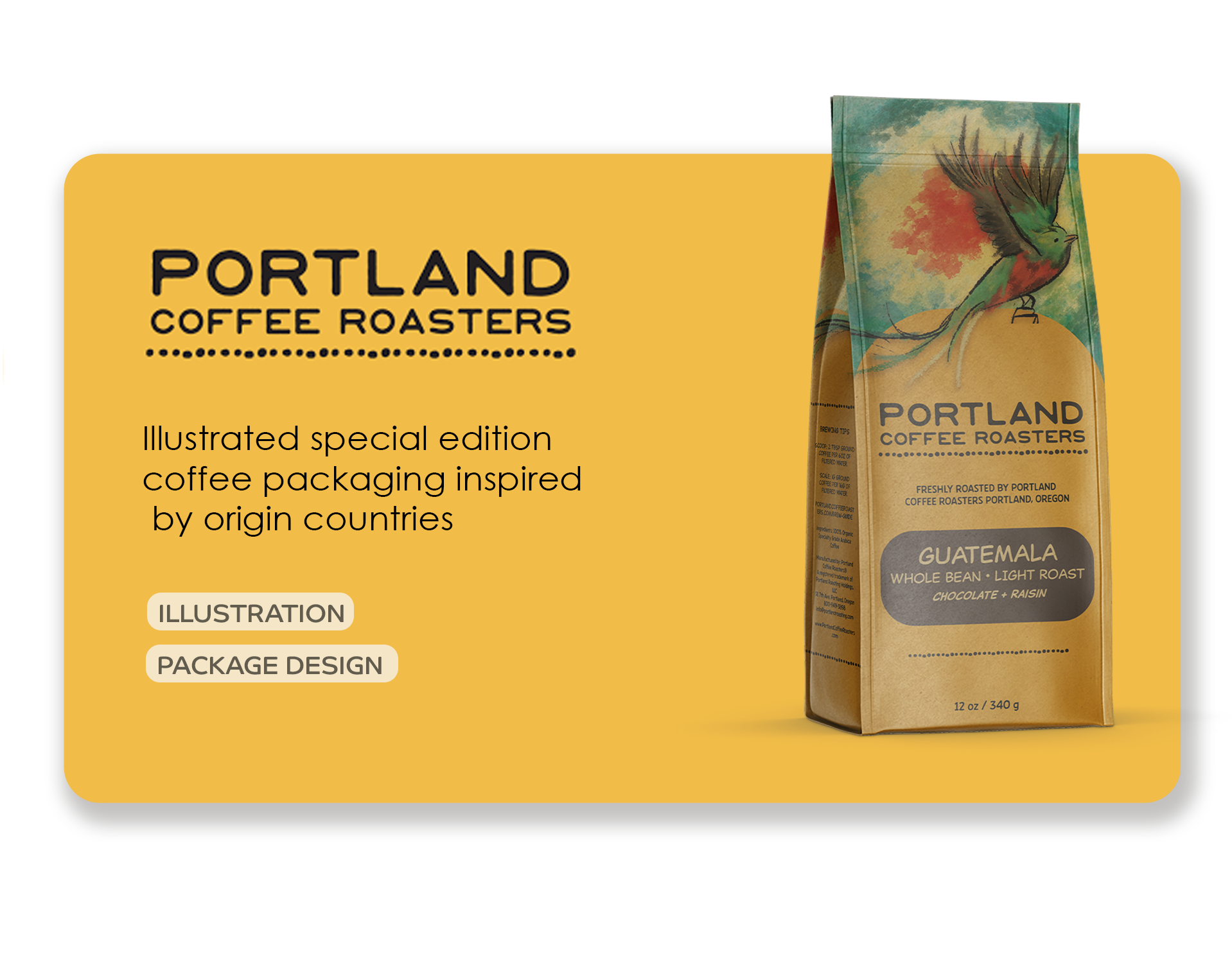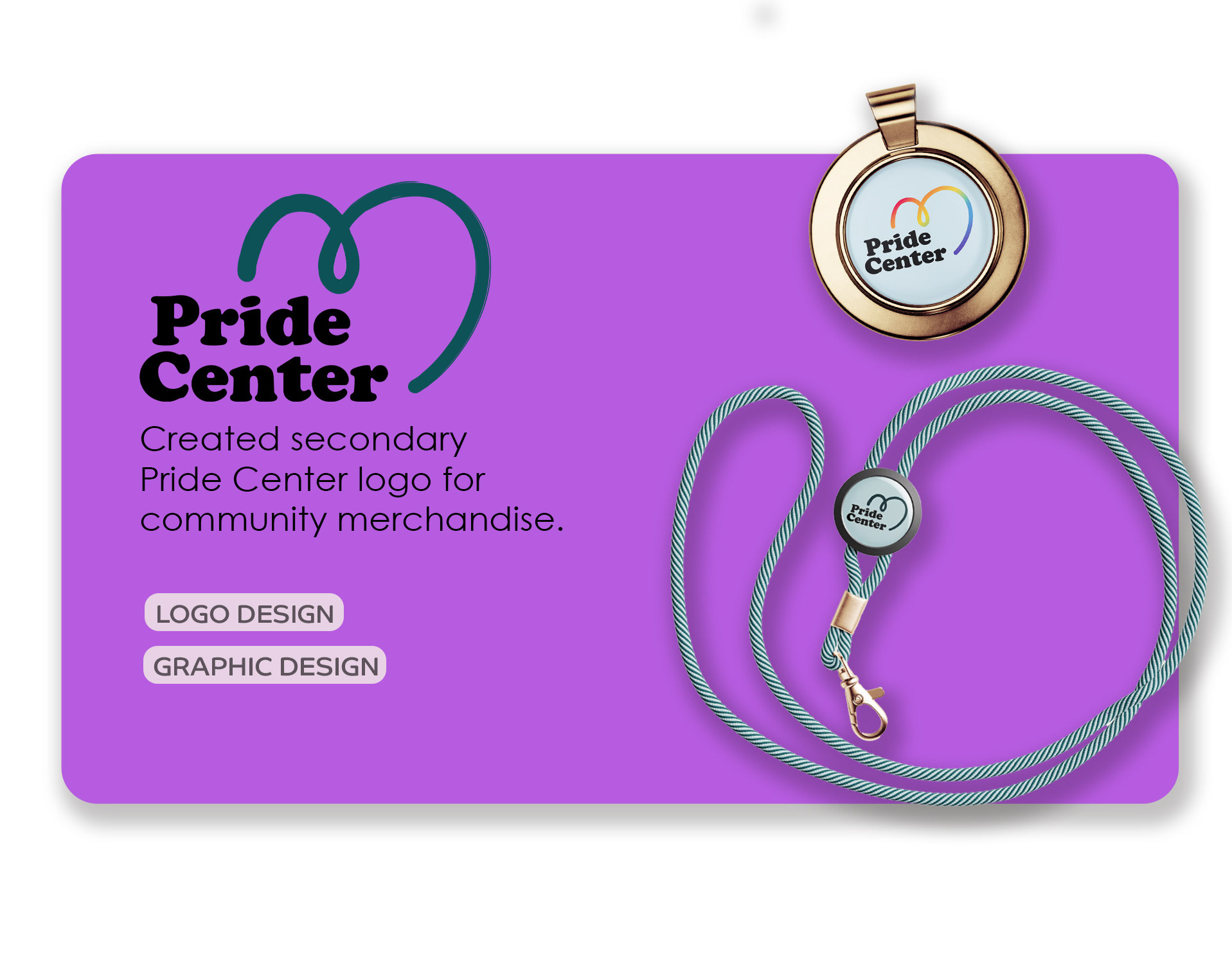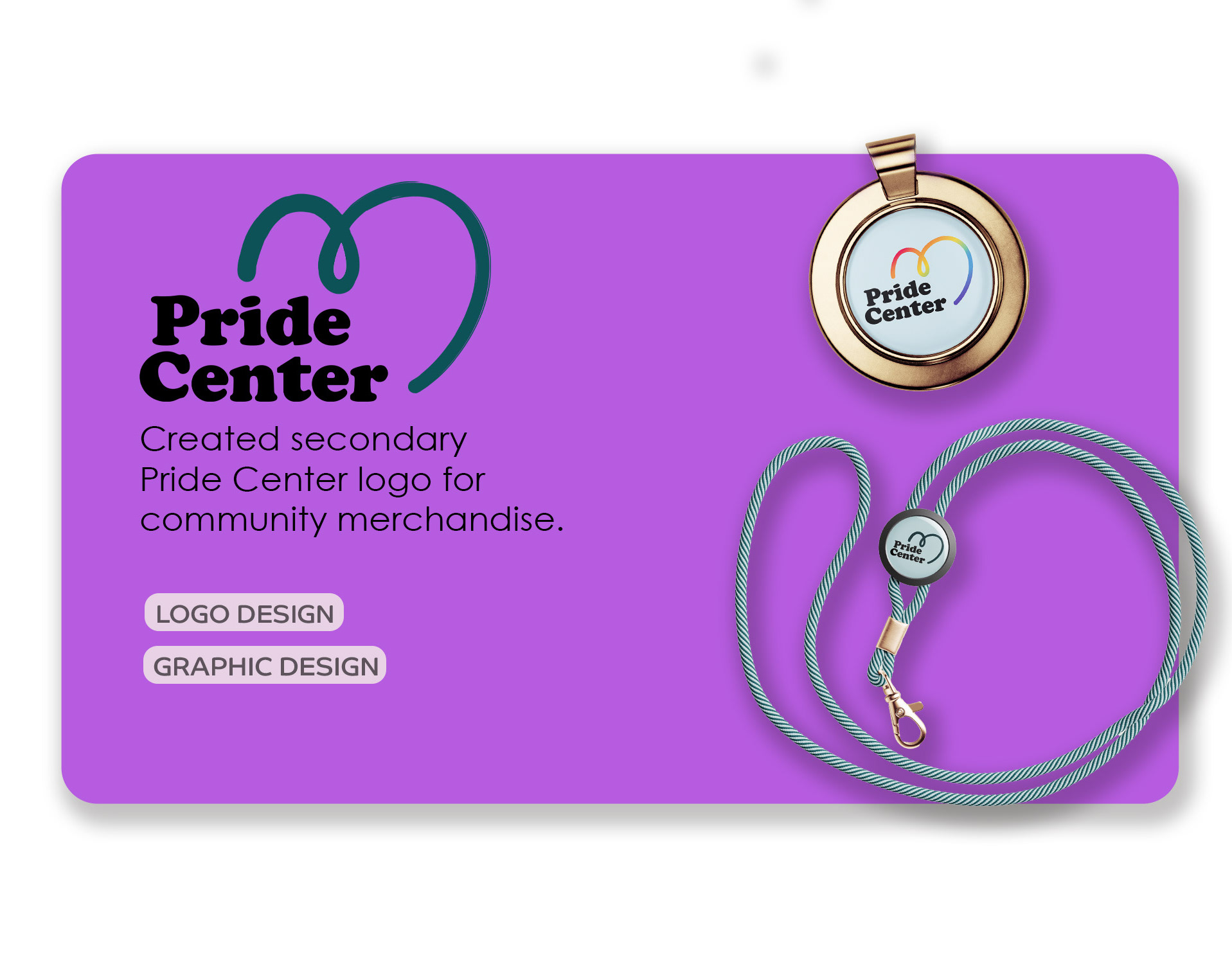

Project Overview
SparkTrendz is an anime clothing brand that partners with artists to create subtle, wearable designs for everyday fashion. For this project, I reworked their logo and branding guidelines to better emphasize their collaboration-driven model and strengthen their visual identity. I also drew back to the time when they would partner with artists to create unique designs.

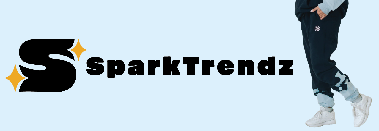
Original Logo

New Logo
The Challenge:
The challenge was balancing expressiveness with simplicity. The brand needed to feel creative and artist-forward, but not overpower the clothing designs themselves. The identity also had to scale across packaging, digital platforms, and merchandise without becoming visually heavy.
Research:
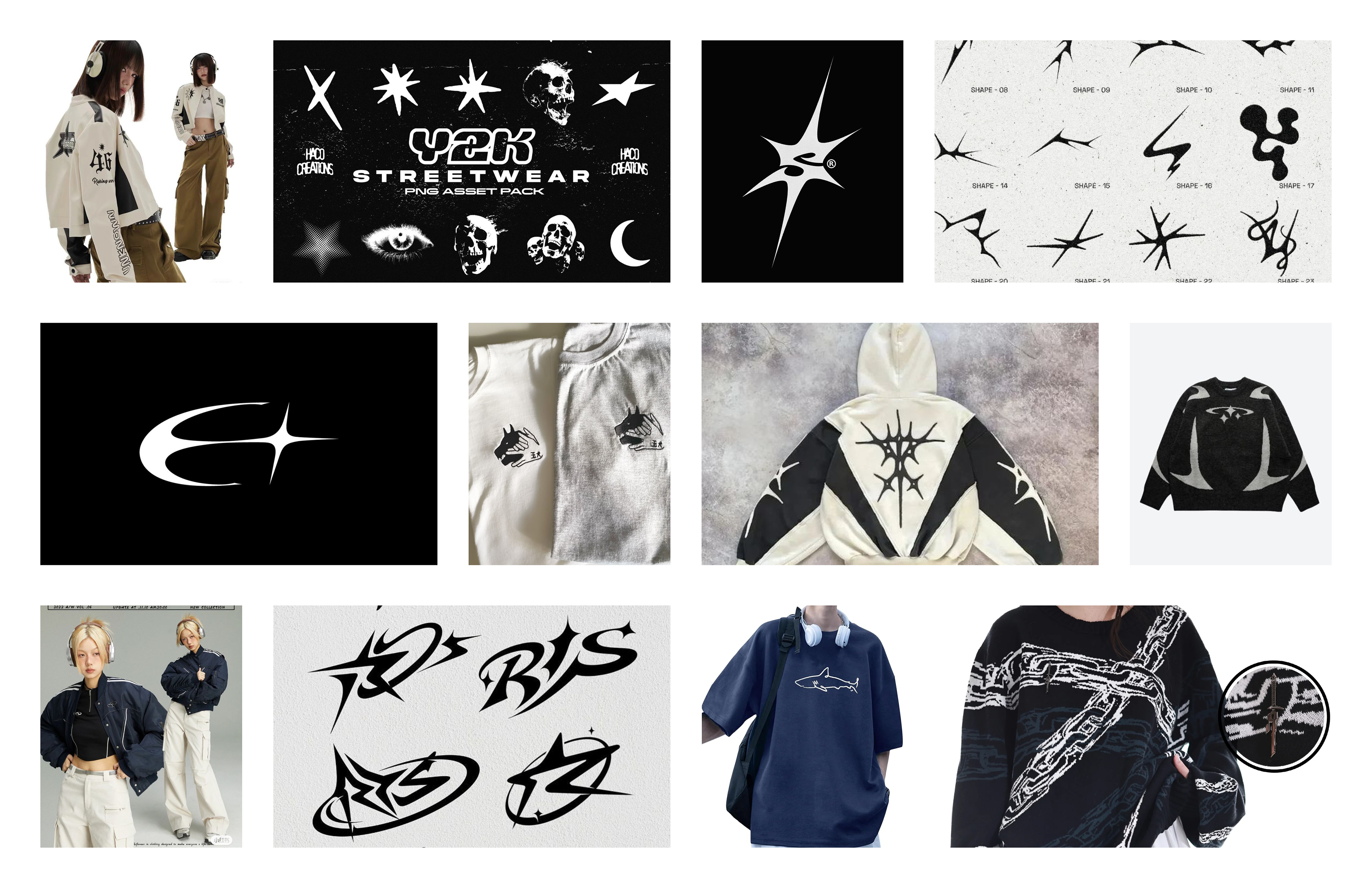
Mood Board
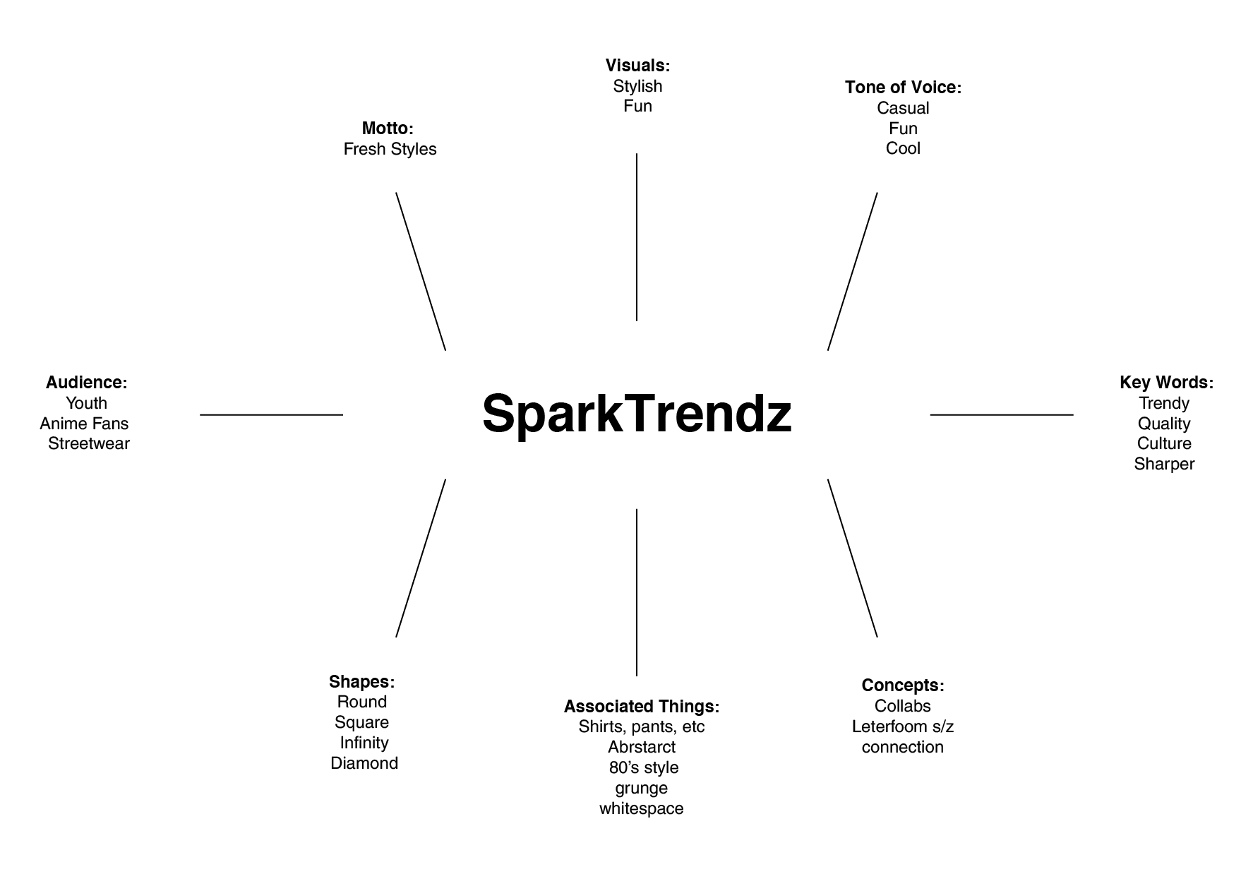
Mind Map
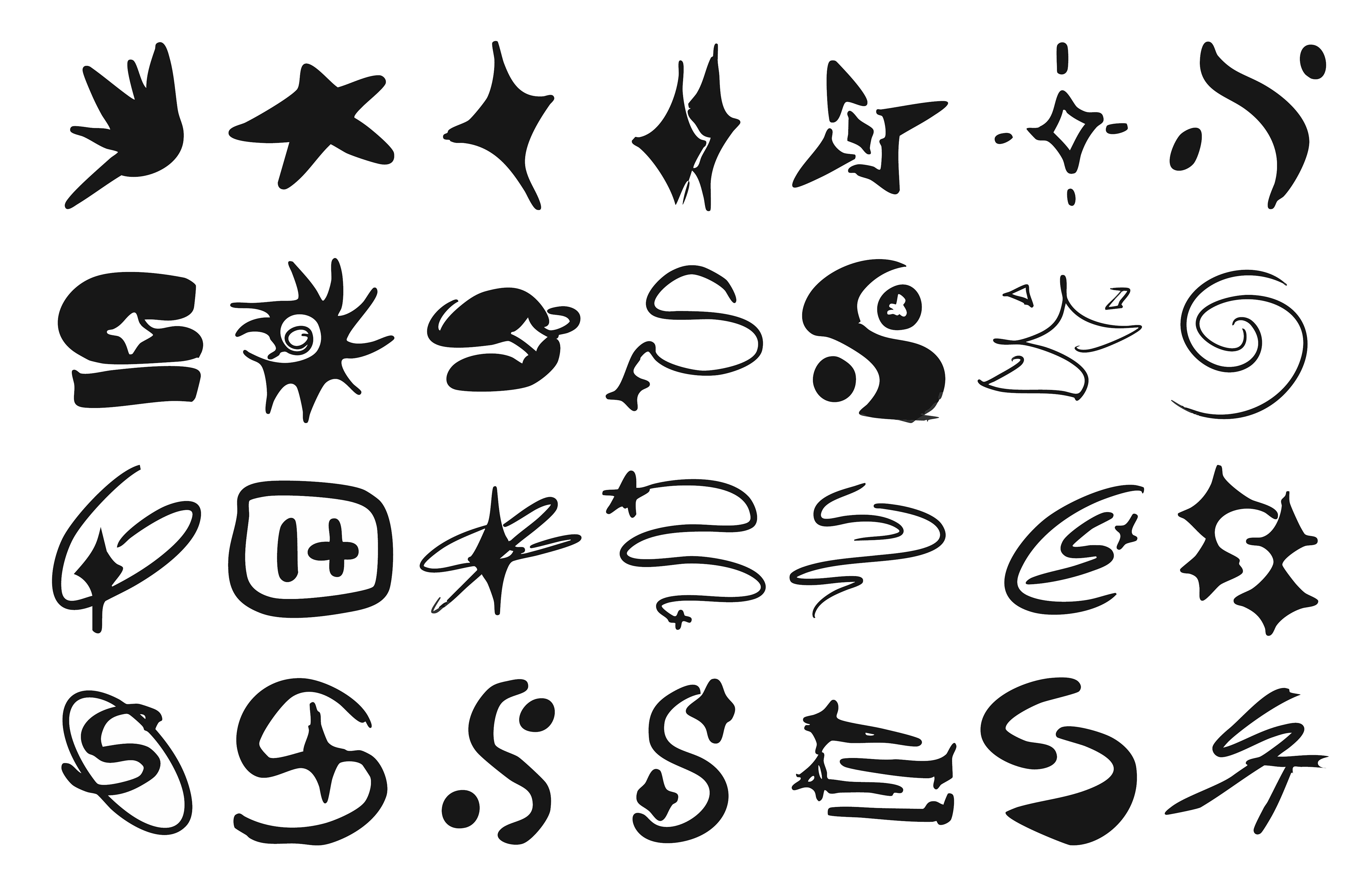
Idea Sketches
Final 3 Concepts:

Route 1

Route 2

Route 3
Route 1: The concept creates an S shape and alludes to the infinity symbol. Infinity can mean connection, and I liked how the brand connects to artists for collaboration. It’s meant to look more of a serious symbol rather than a cute one.
Route 2: I elongated the sparkle to create a negative space S. This brand has some minimalist pieces in their early days and I wanted reflect to that. This has a more friendly look that their more recent pieces have had.
Route 3: A more direct approach to their name, taking the S for Spark and incorporating sparkles. The top almost has a snake like look to it. Snakes can have meanings of eternity, which can reference to how their subtle pieces have a timeless look. z
Final Concept:
I refined the logo system and developed updated branding guidelines centered around the concept of “sparks.” The spark elements symbolize both the artists and the buyers, connected through the clothing they share. The visual direction remains simple and bright, allowing the apparel to shine (or rather.. sparkle) while reinforcing the brand’s collaborative spirit.

Black Icon

White Icon
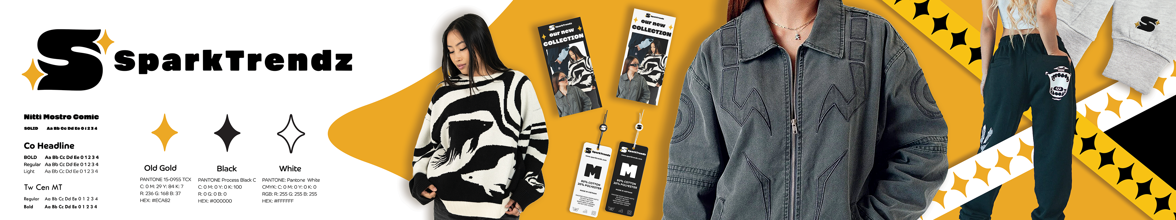
Style Scape
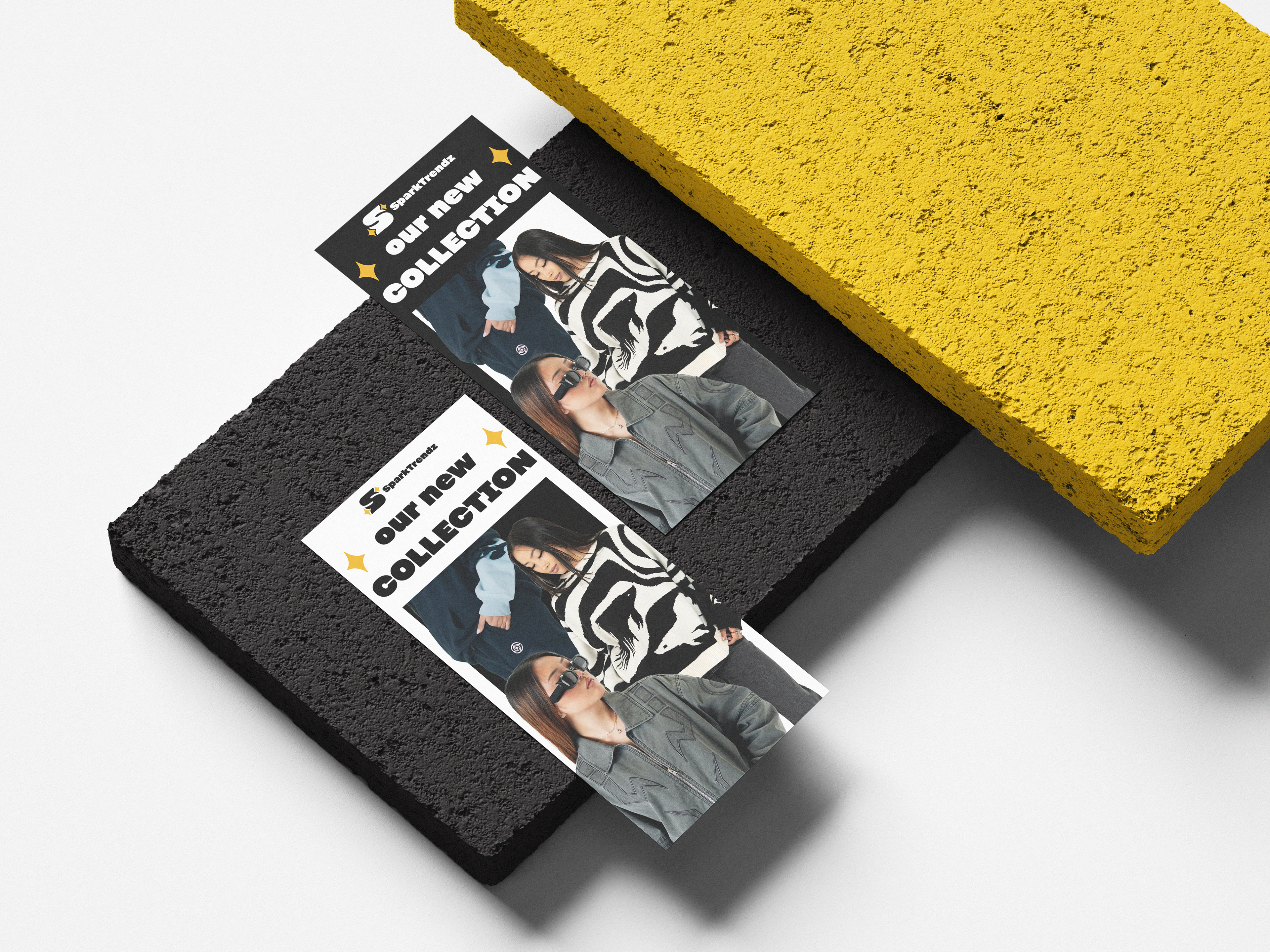
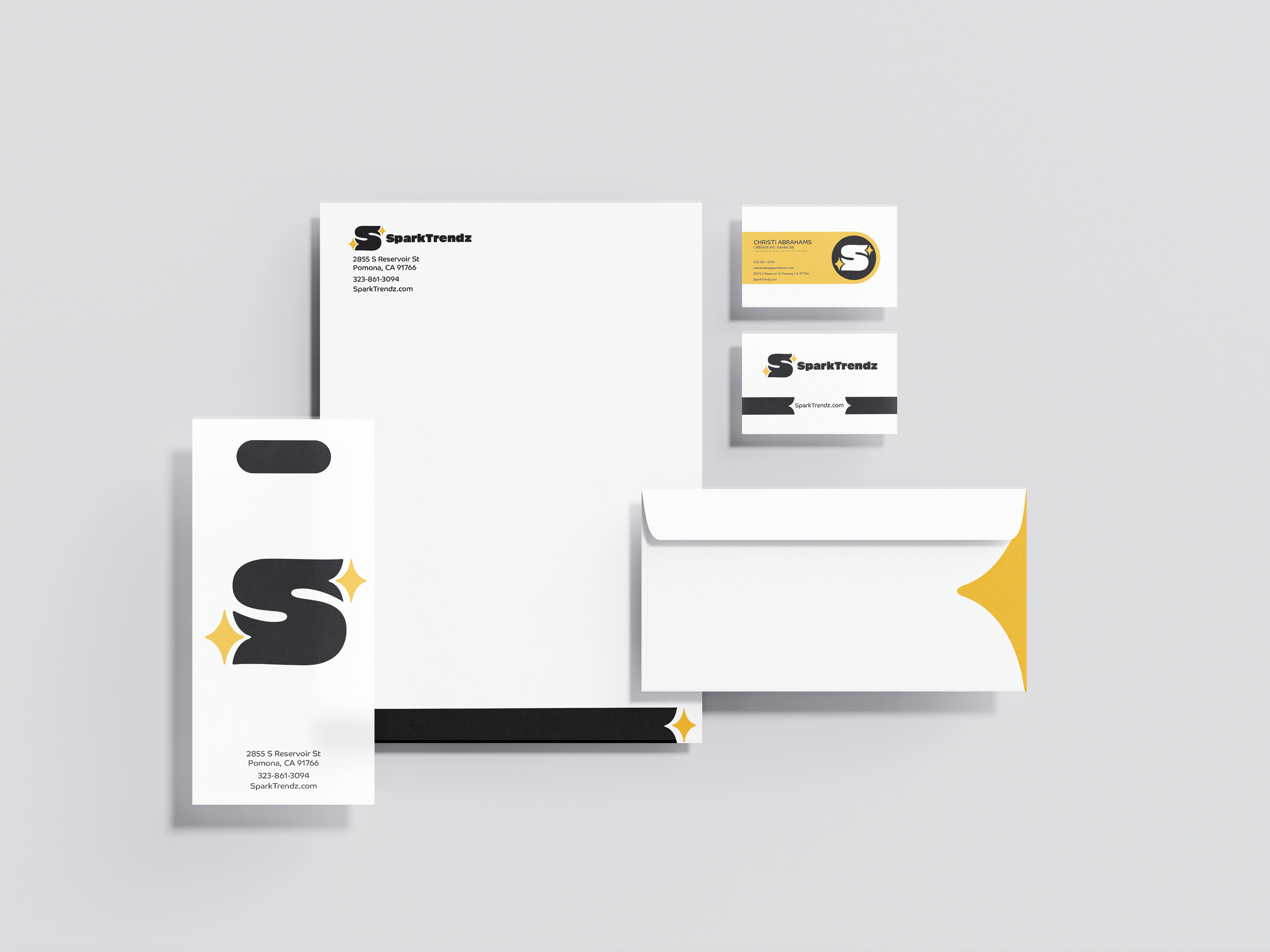
Mockups:
Included packaging tape, embroidery, marketing pamphlets, stationery, and clothing tags. Created a Style scape for branding guidelines.
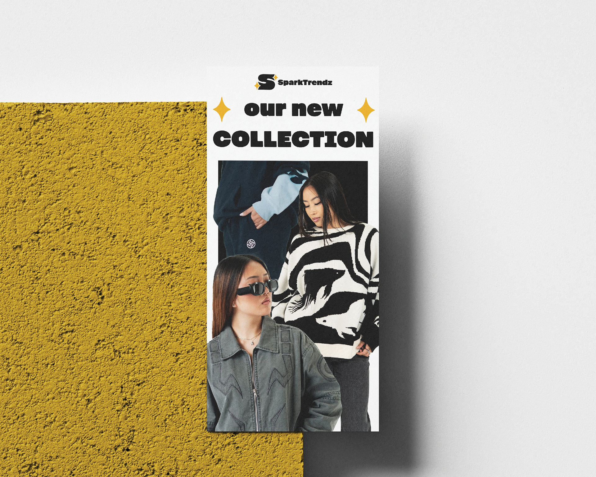
pamphlet
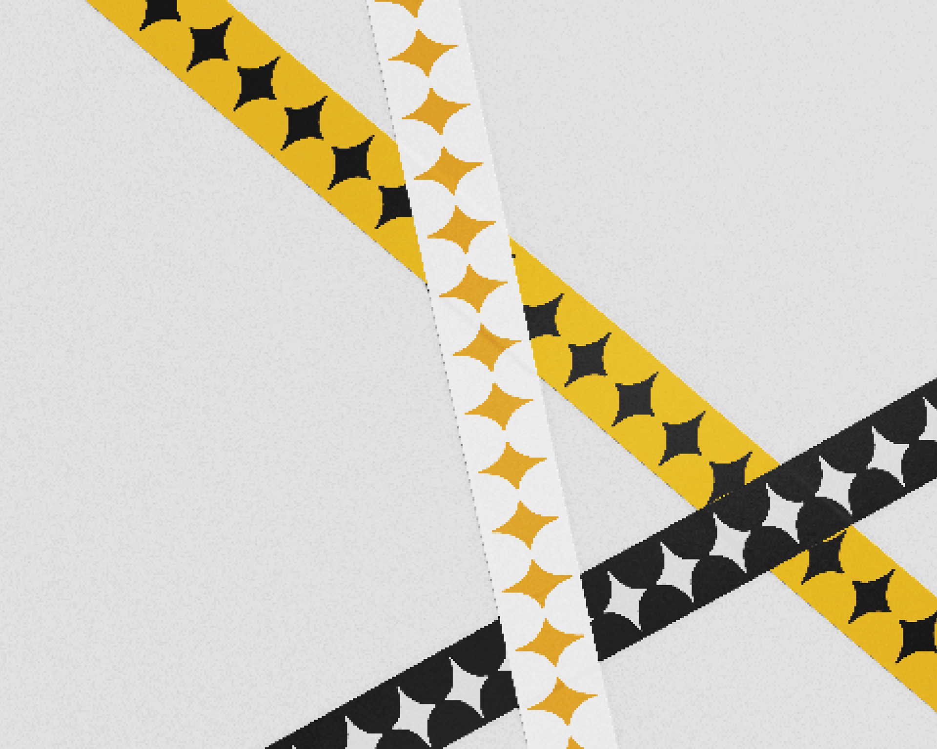
packaging tape
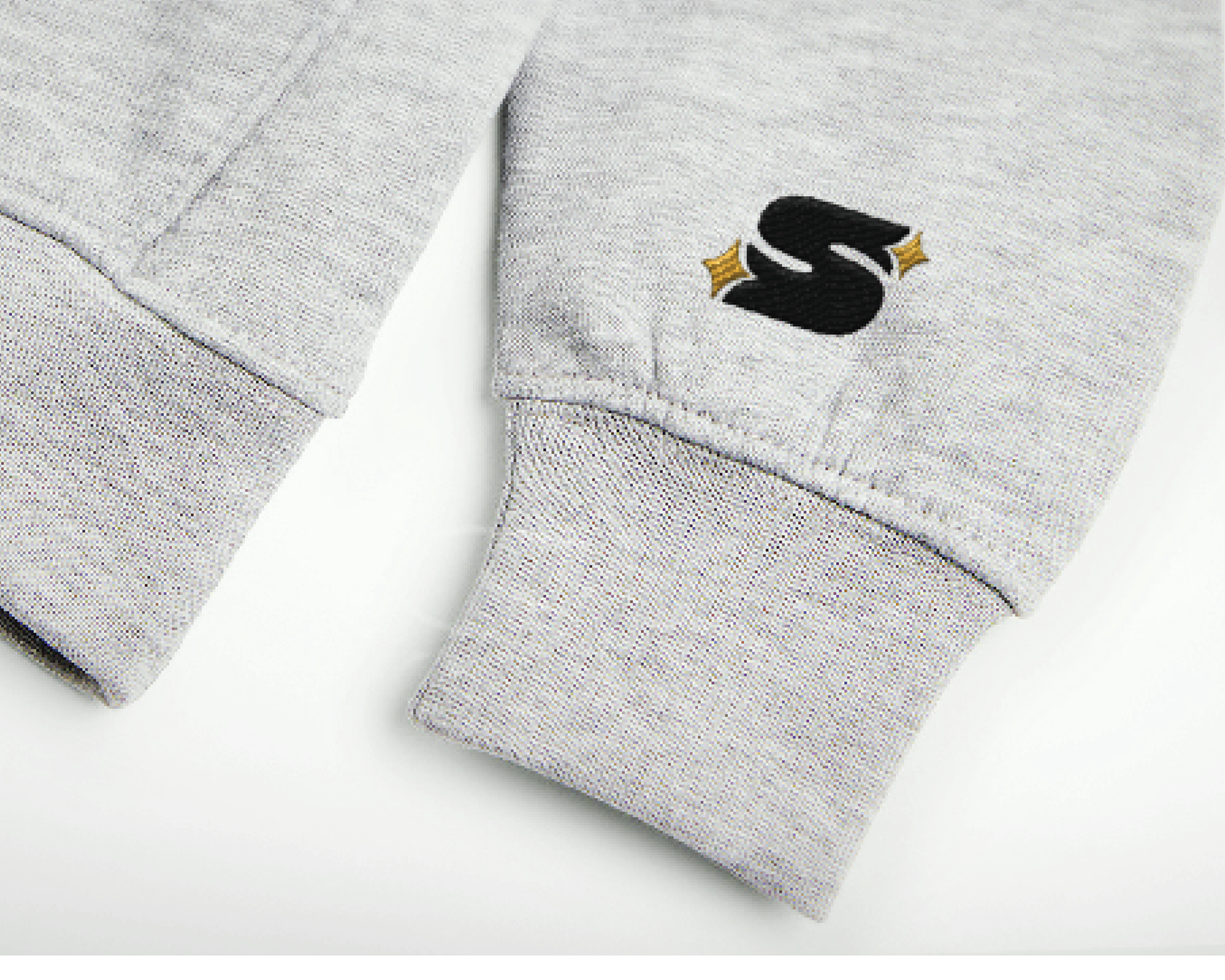
embroidery logo
The Outcome:
The rebrand creates a clearer visual narrative around artist collaboration and community connection. By simplifying the system and reinforcing the spark concept, the identity feels cohesive, scalable, and aligned with the brand’s mission.