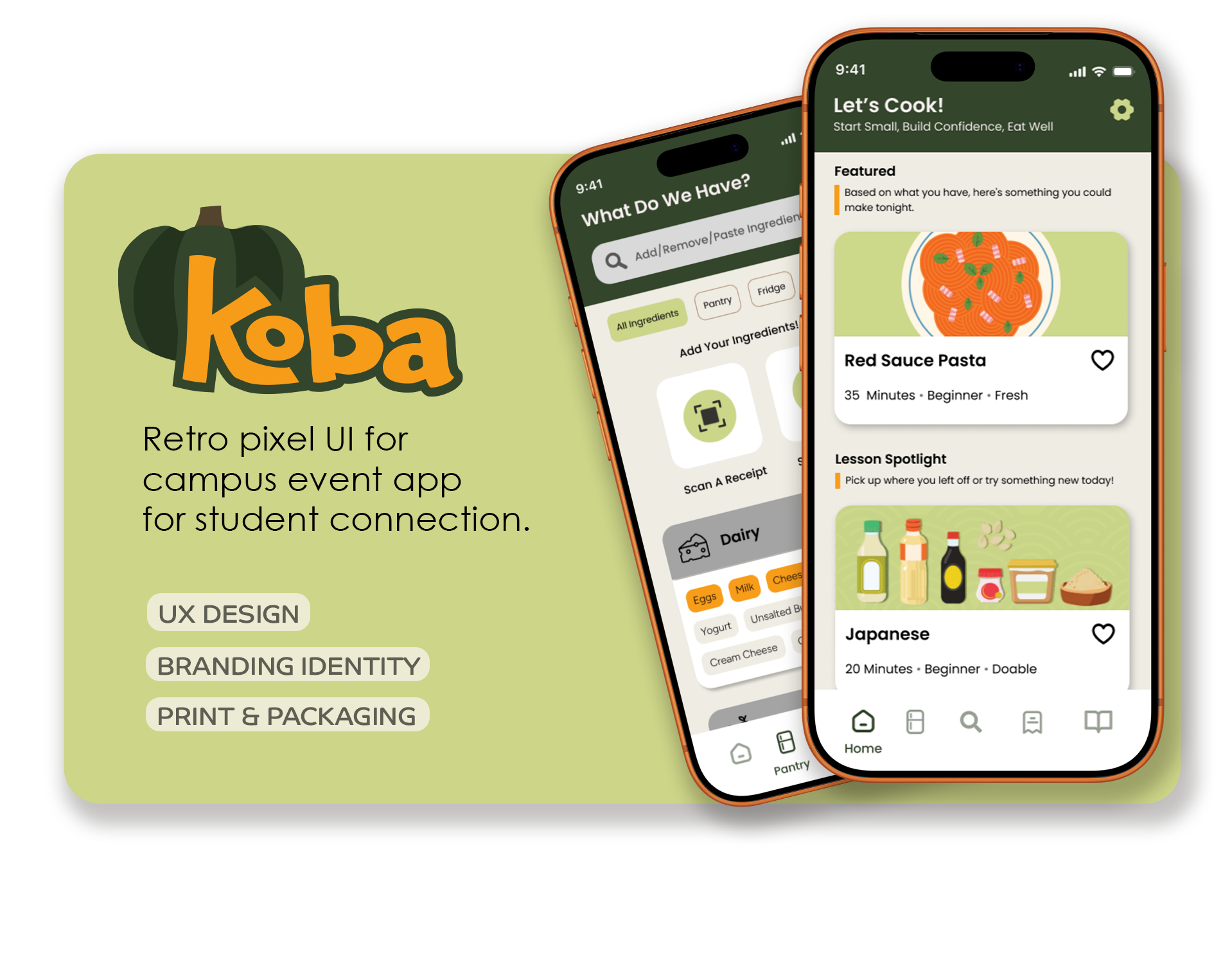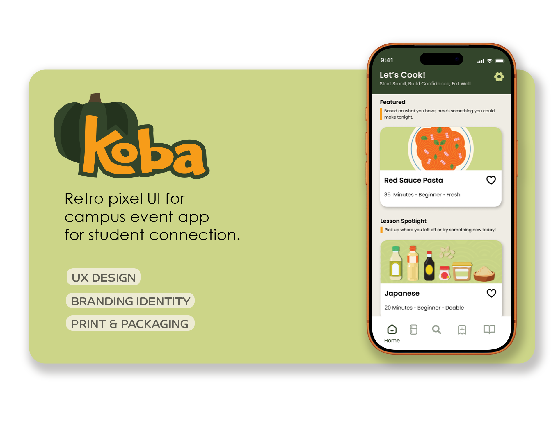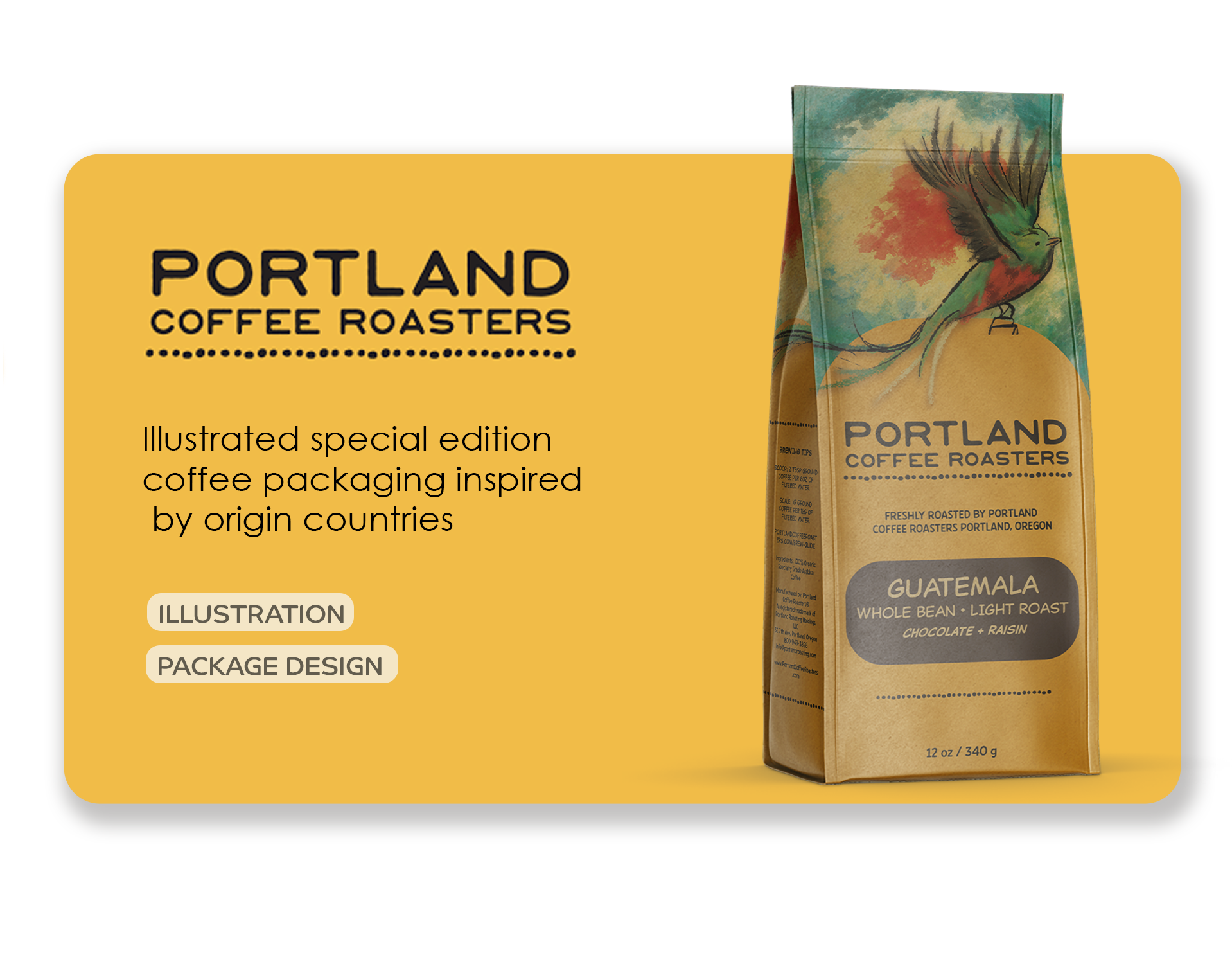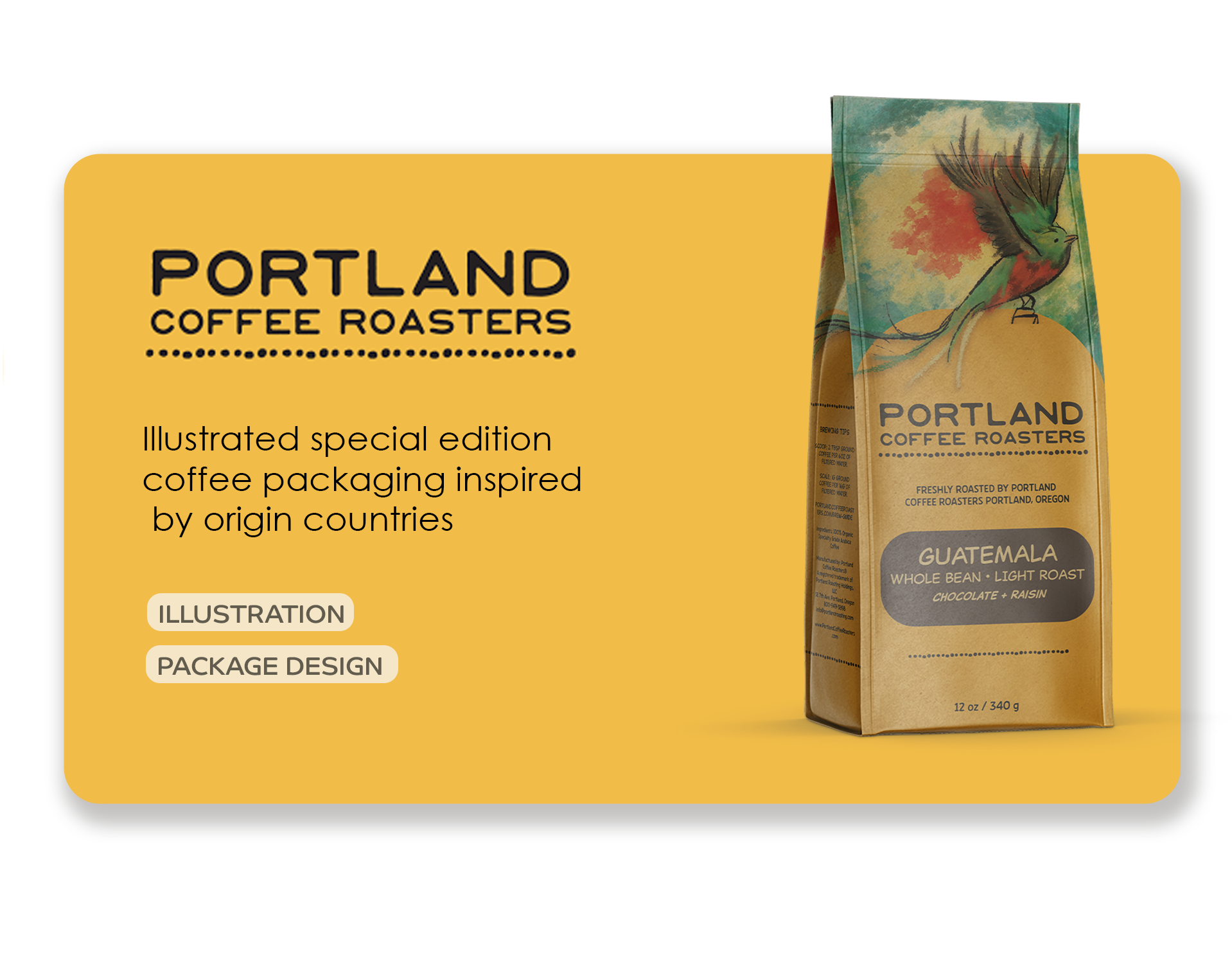

Project Overview
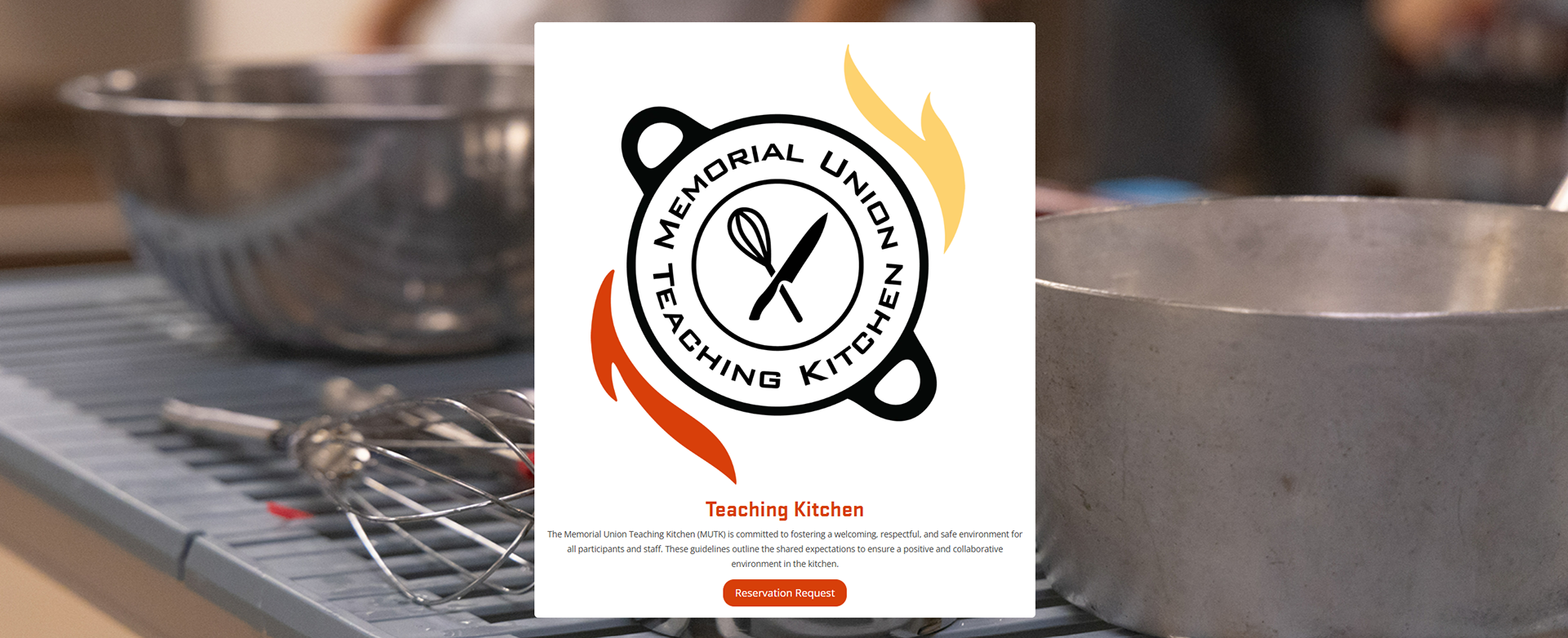
The Memorial Union Teaching Kitchen (MUTK) serves as a collaborative space where students and campus partners host events centered around food, culture, and learning. The goal of this redesign was to create a visual identity that reflects inclusivity, creativity, and community ownership, while providing the kitchen with a cohesive and recognizable brand presence within Oregon State University.
Following a departmental transition, the Teaching Kitchen no longer had a visual identity that reflected its evolving mission. There was no existing logo system, and promotional materials lacked consistency. This project focused on developing a flexible brand identity that could support a variety of events, from cultural cooking nights to educational workshops, while maintaining a unified visual presence. The goal was to create an identity that could support a wide range of programming, from cultural cooking nights to educational workshops, without feeling tied to a single cuisine, aesthetic, or audience.
Role:
Creative Director
Graphic Designer
Services:
Brand Ideation
User Research
Logo Design
The Challenge:
The primary challenge was designing for a space that is intentionally flexible. The Teaching Kitchen does not represent one specific demographic or culinary tradition; instead, it serves as a platform for many voices. The identity needed to communicate warmth and collaboration without becoming visually generic or overly institutional. Because there was no existing logo to refine, the process required building a cohesive brand language entirely from scratch.
Sketches:
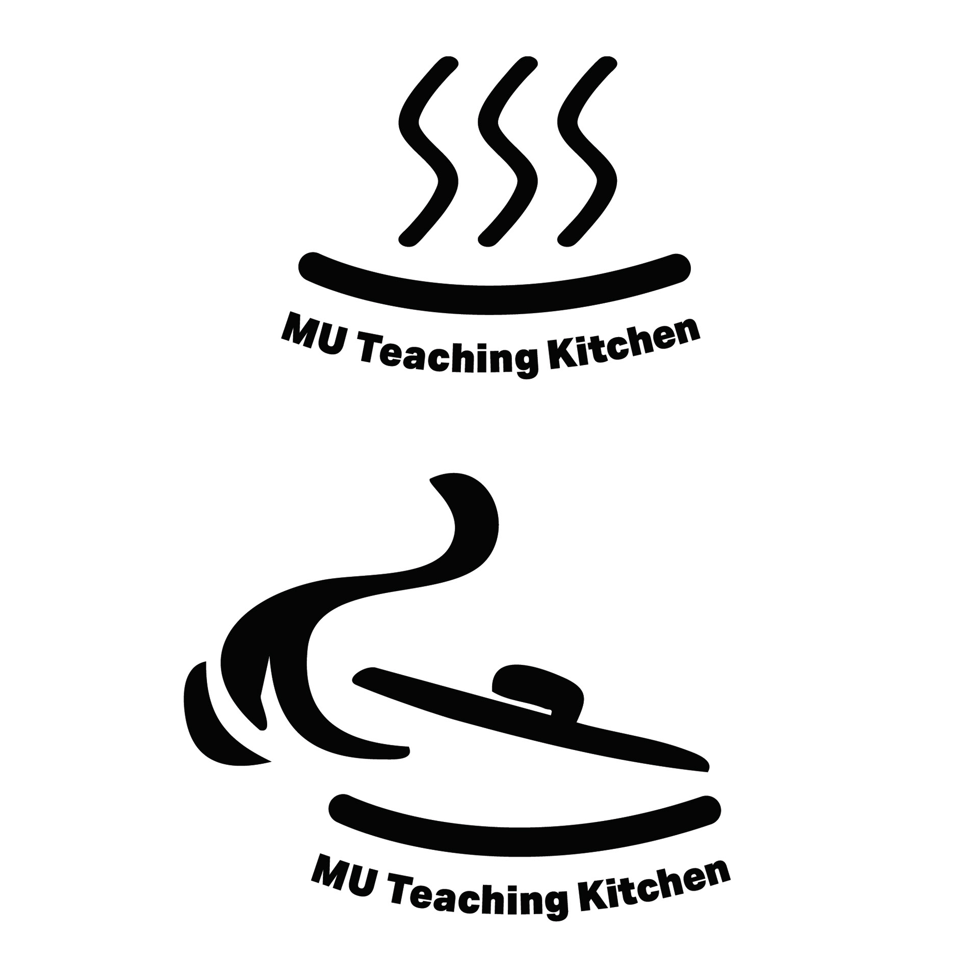
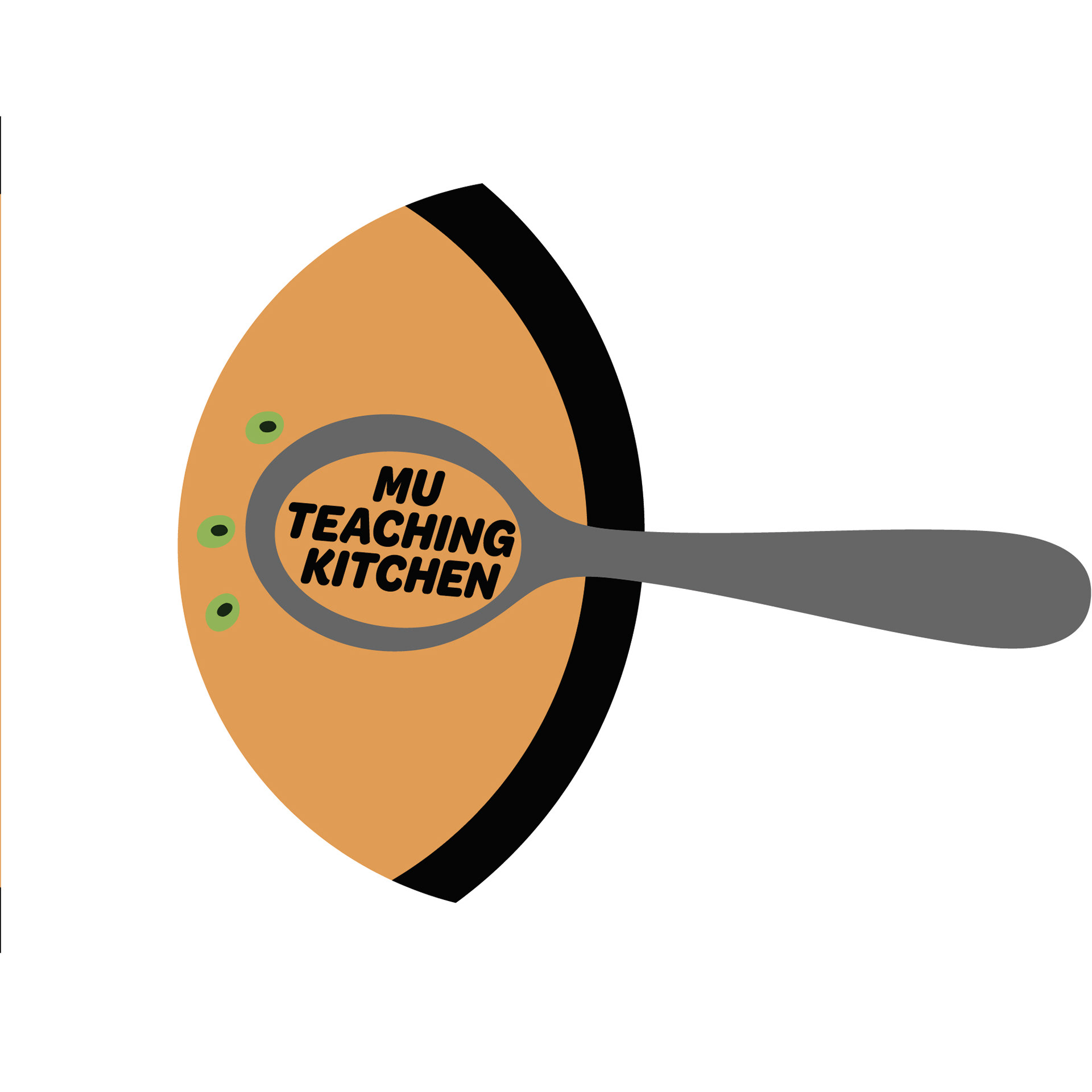
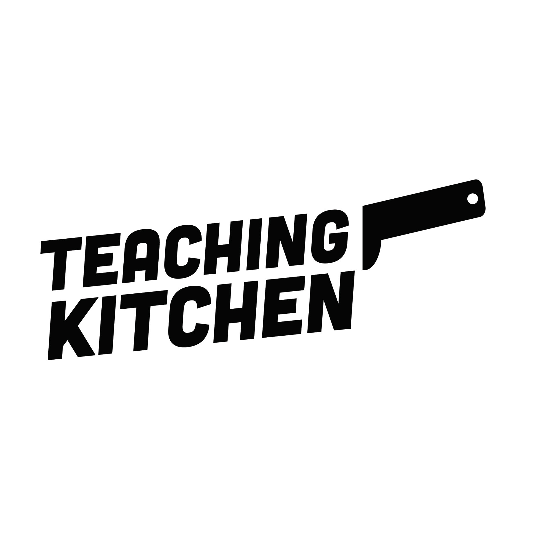
The Concept:
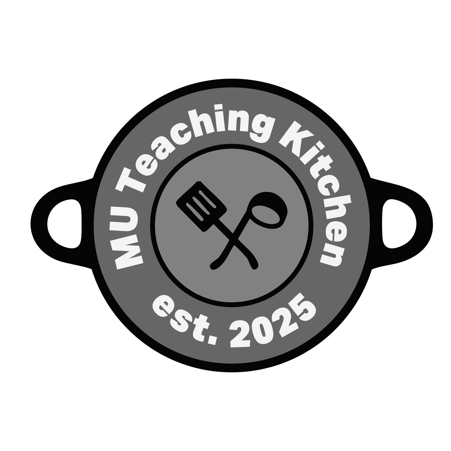
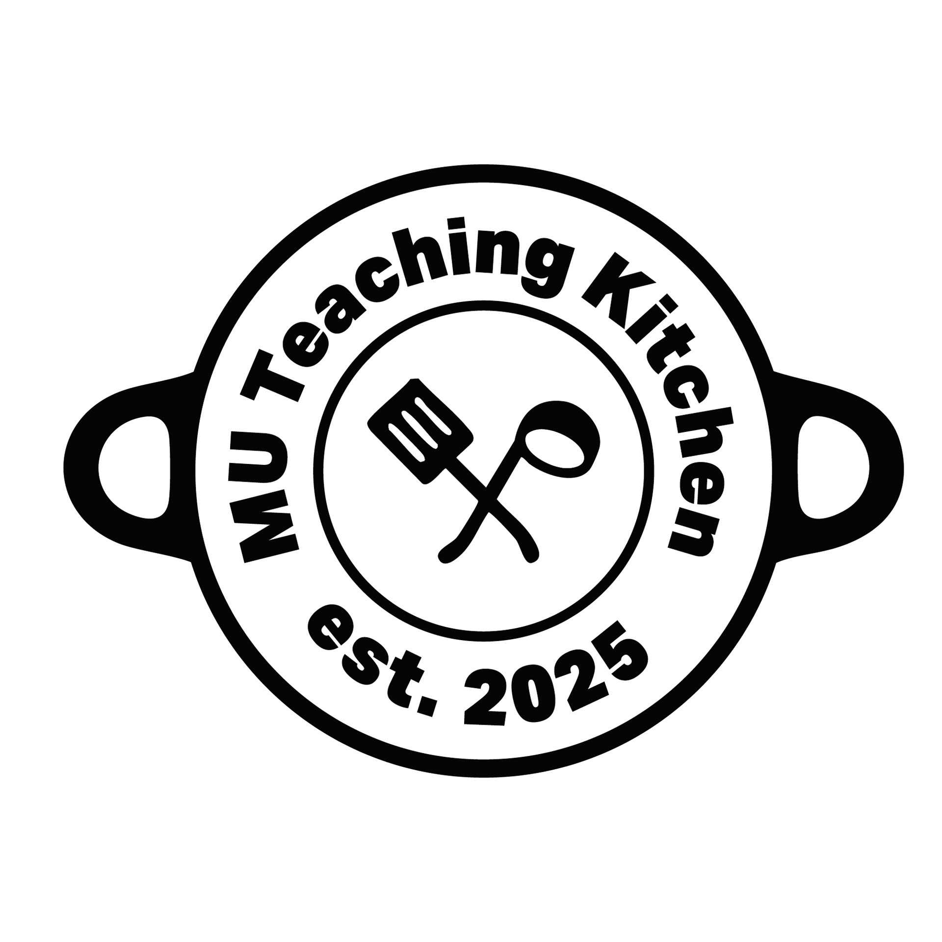
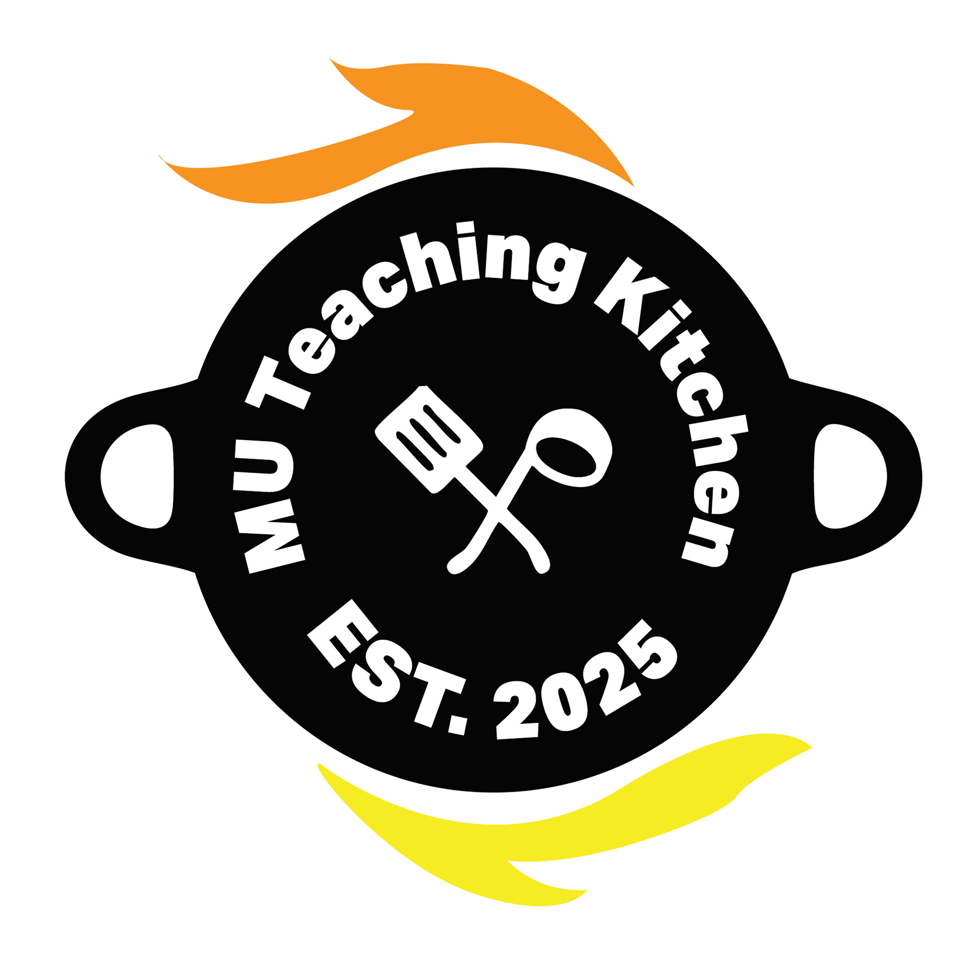
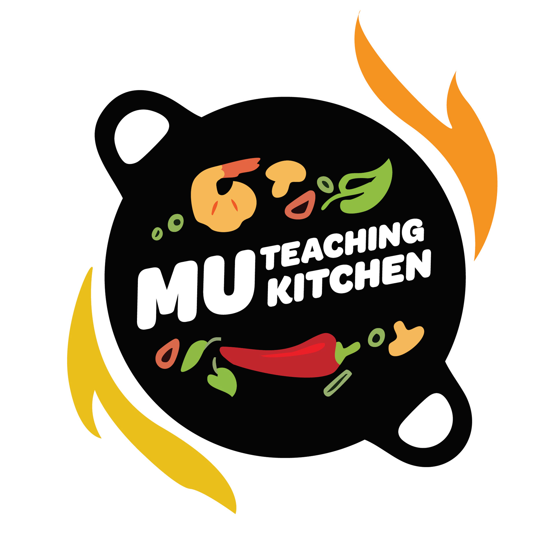
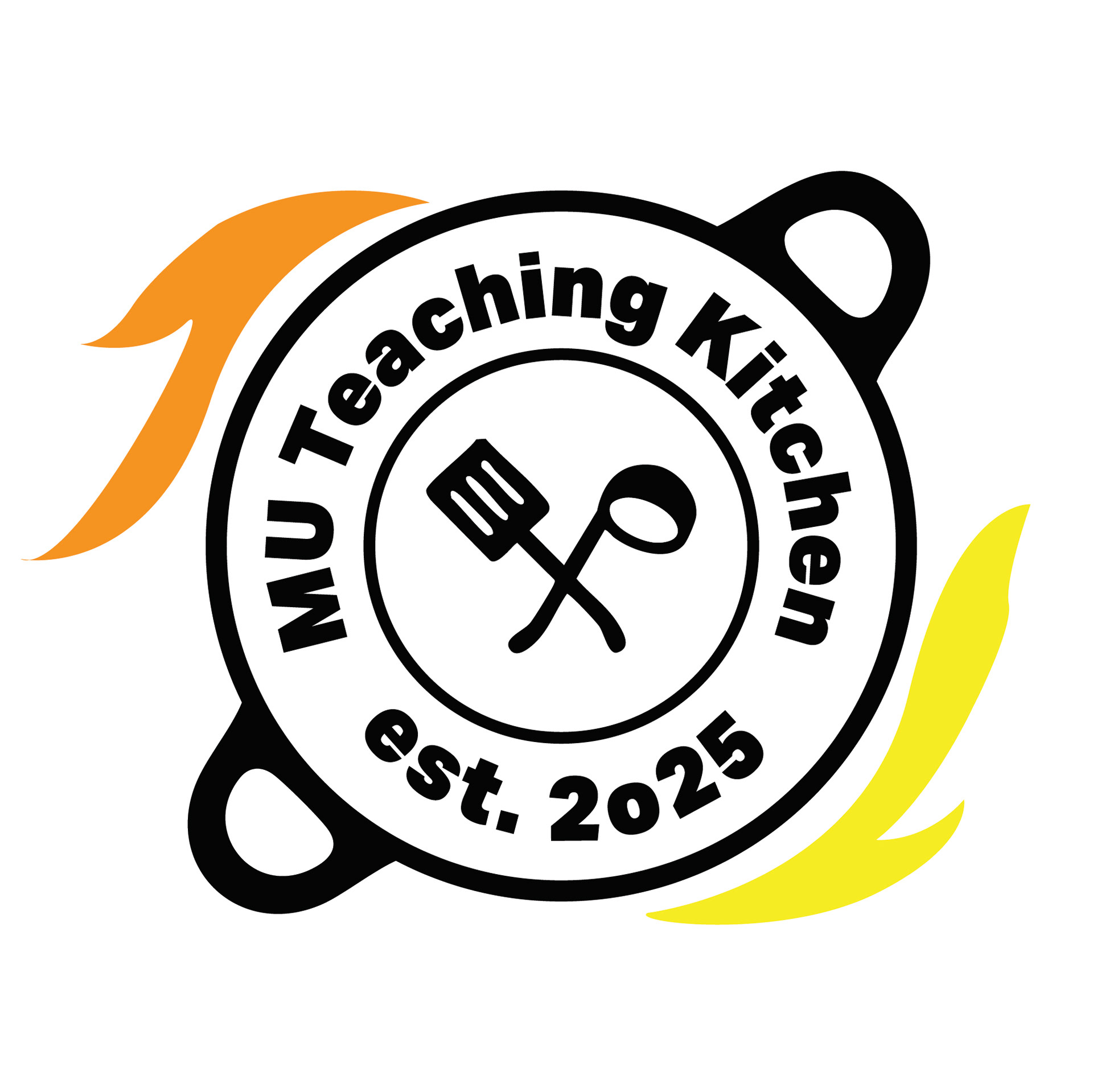
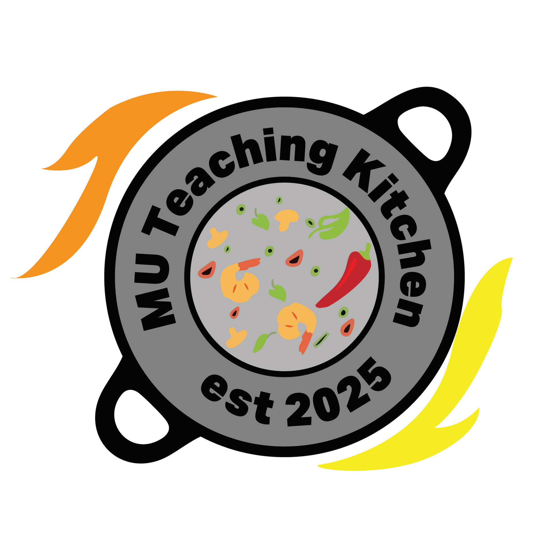
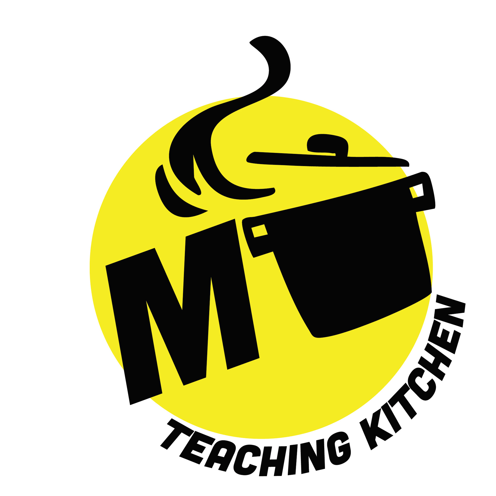
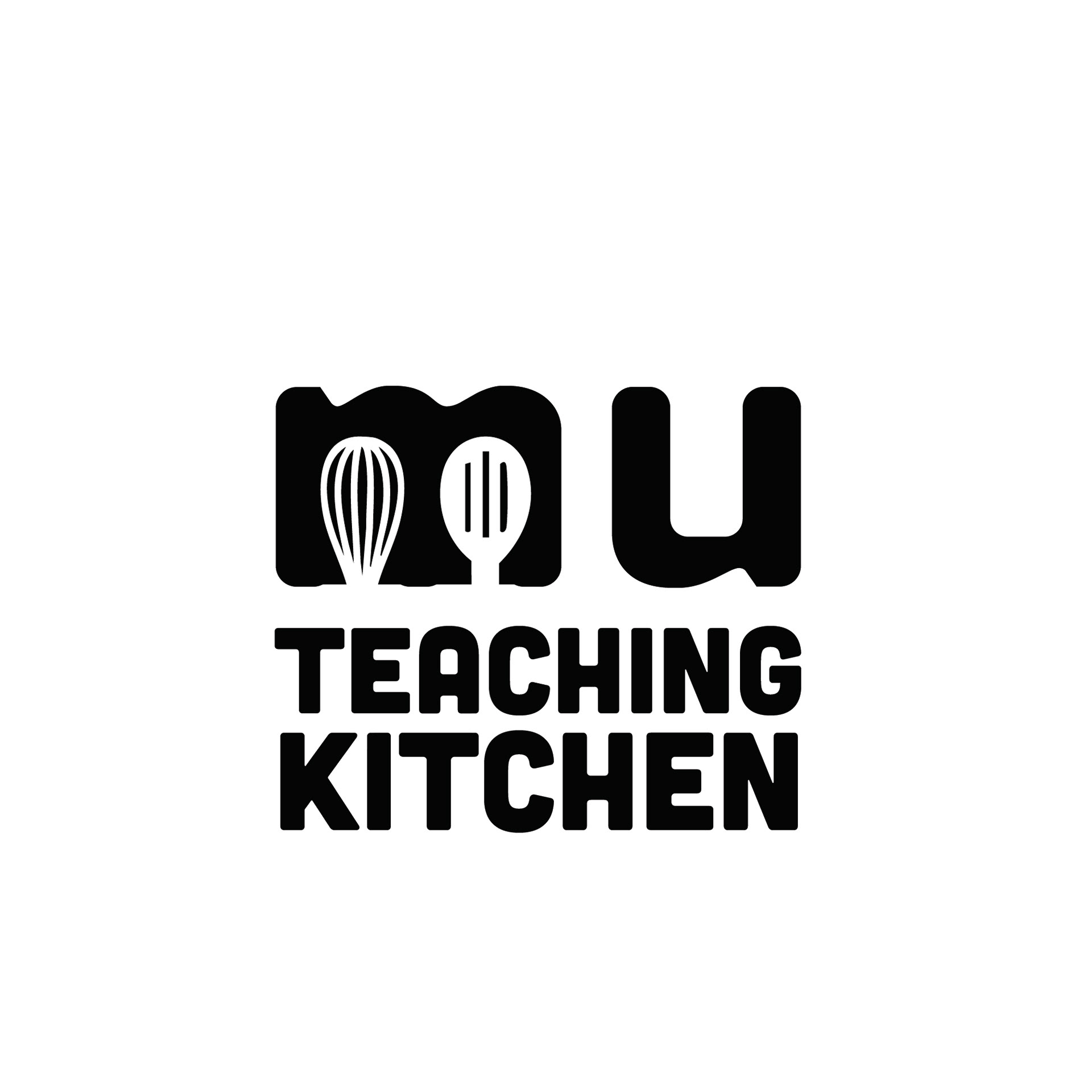
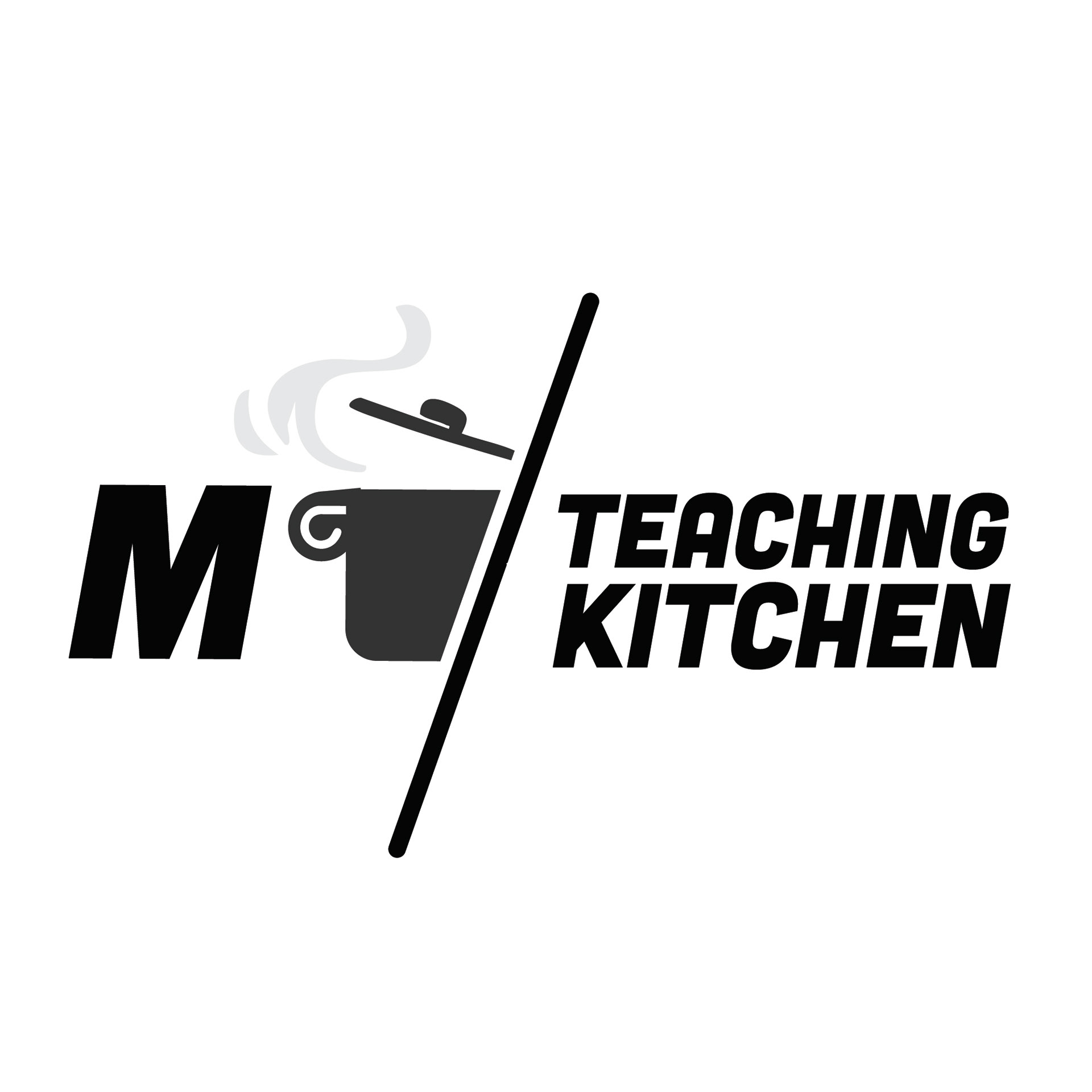
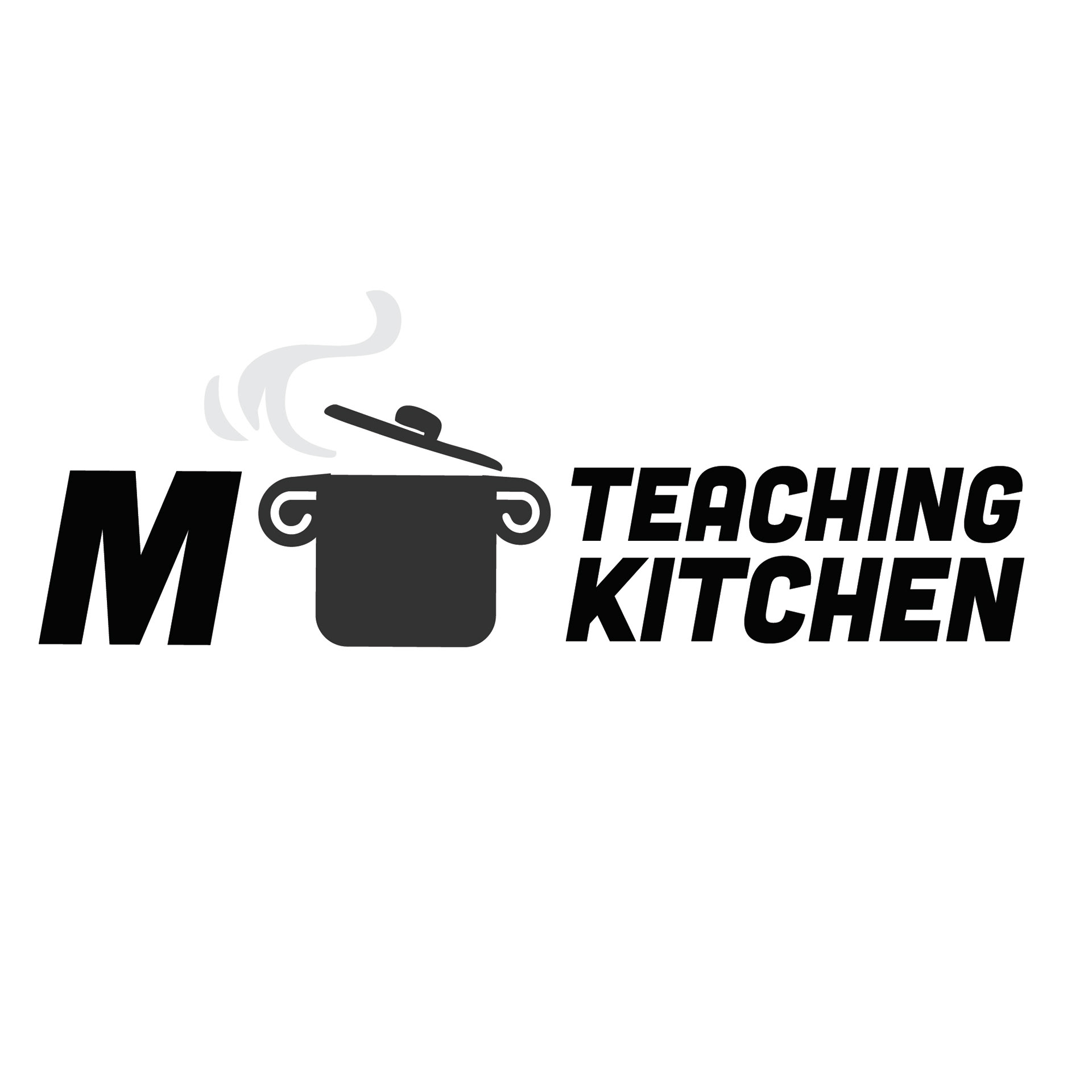
The final concept centers on the form of a pot as a symbol of gathering and transformation. While the pot references cooking directly, it also operates metaphorically as a container for ideas, culture, and shared experience. Its shape suggests warmth and activity without relying on detailed illustration, allowing the mark to remain flexible and inclusive. The ambiguity of the form was intentional. Rather than tying the brand to one specific culinary identity, the symbol supports the idea of the Teaching Kitchen as a space where many influences come together.
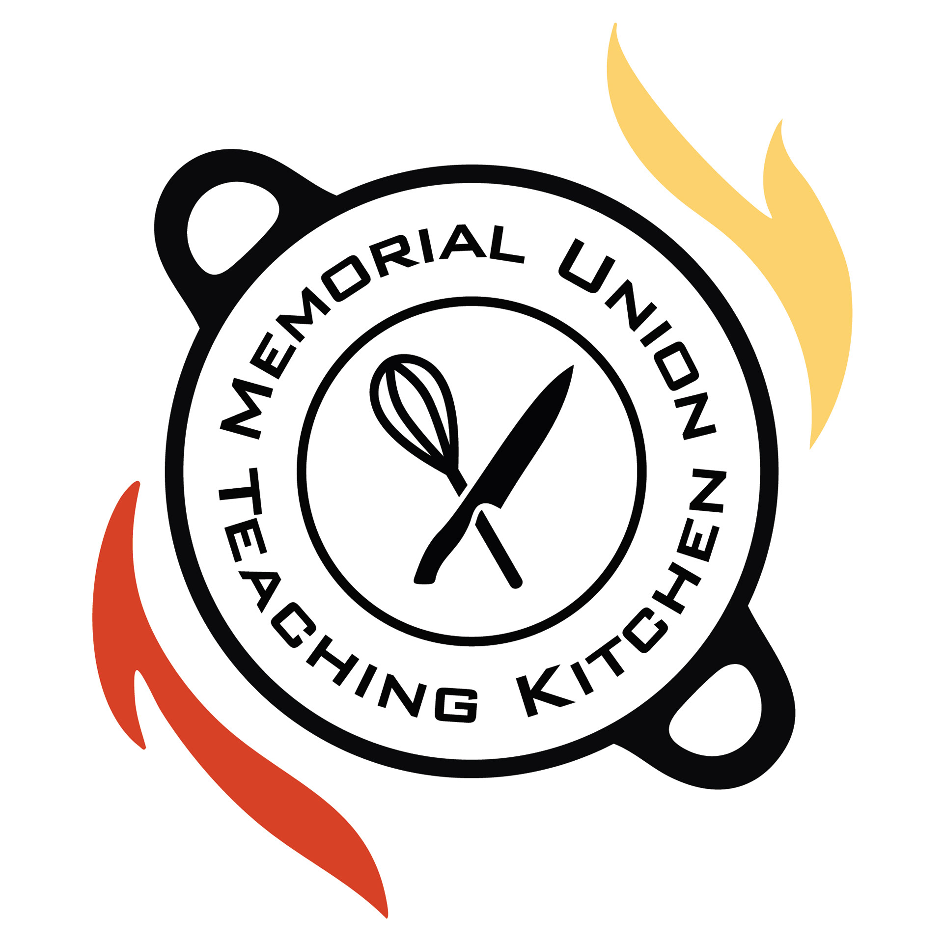
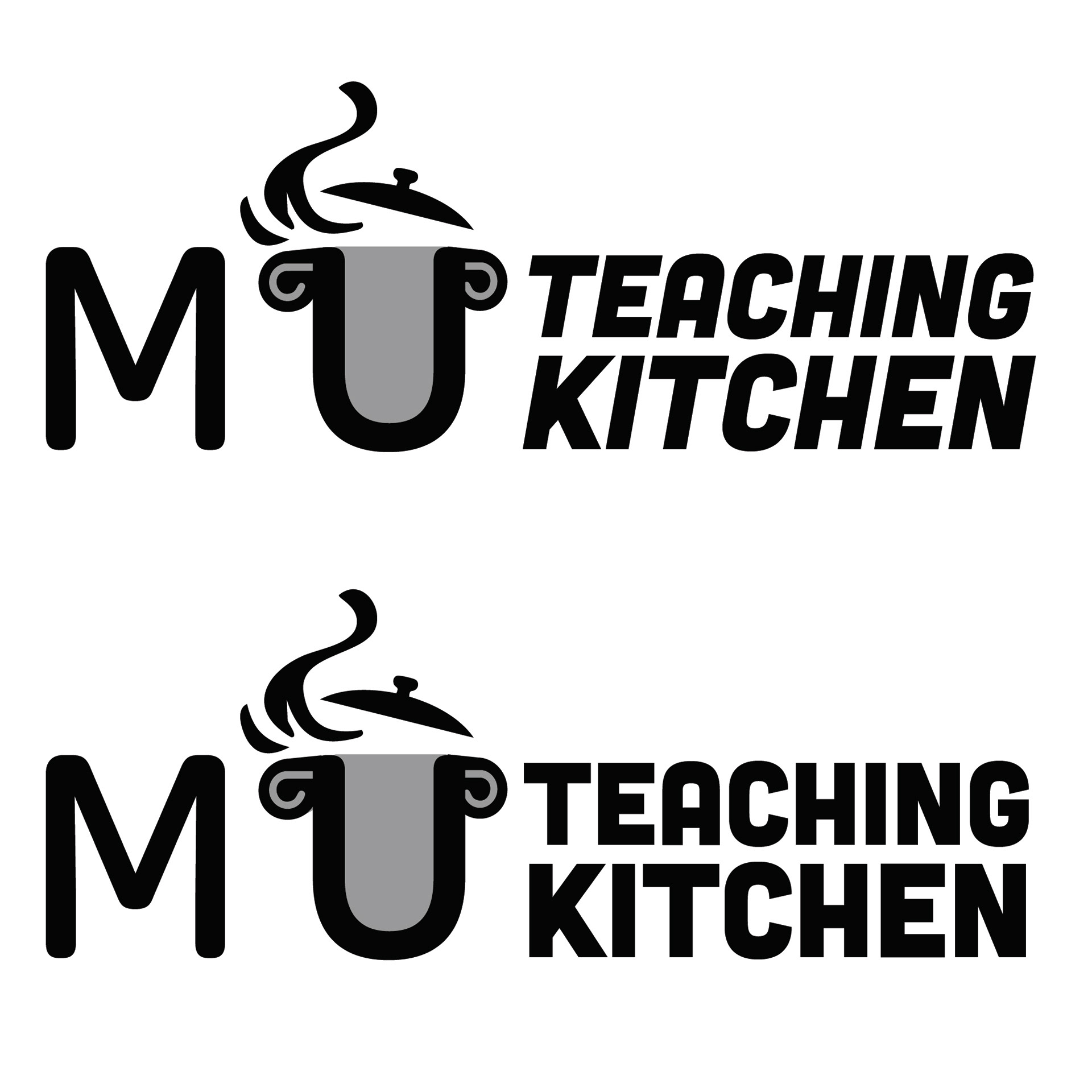
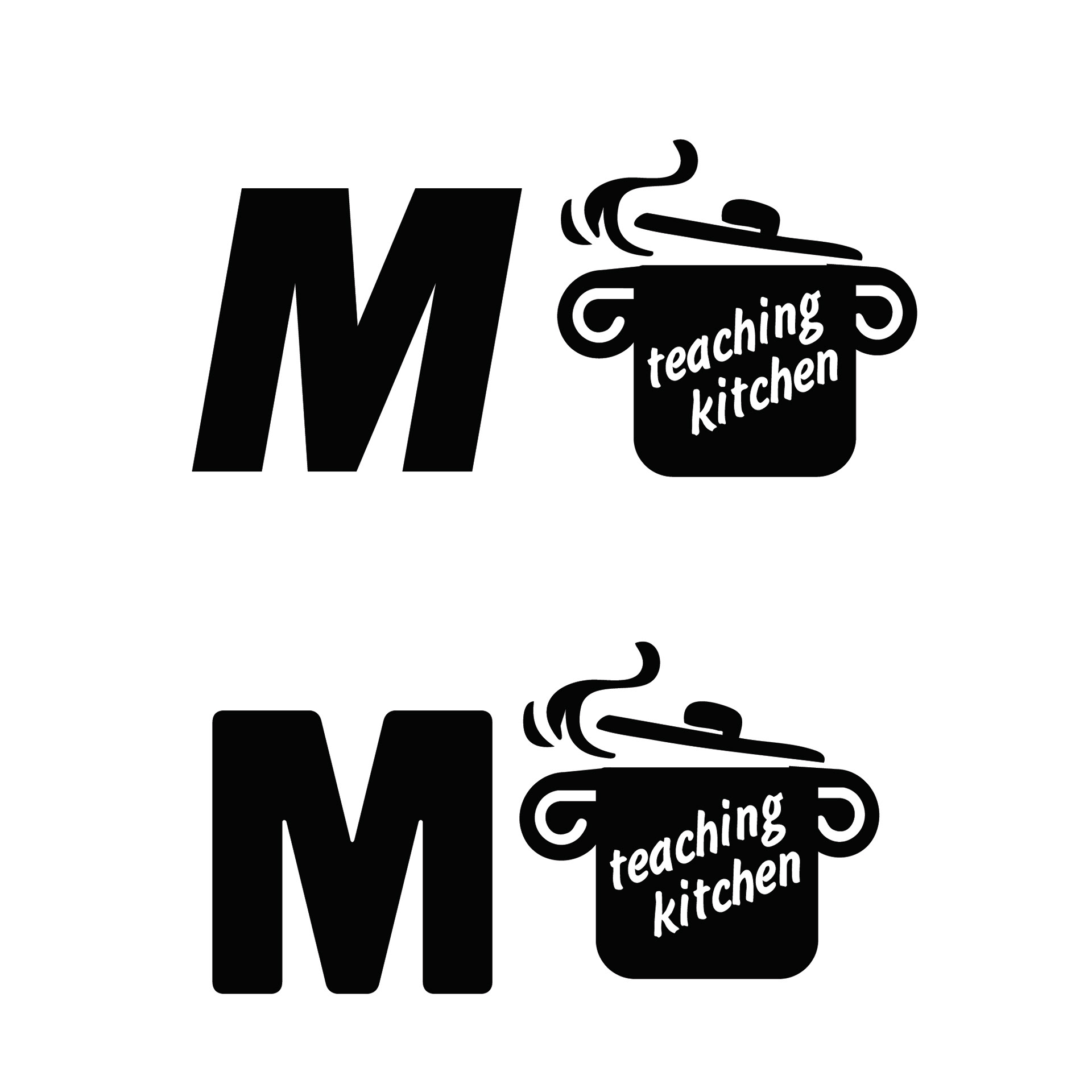
Final Logo
The Outcome:
The resulting identity system provides MUTK with a scalable and cohesive brand presence across print and digital materials. The logo functions clearly at multiple sizes, and the accompanying poster system allows future events to maintain consistency while adapting to different themes and audiences. The redesign establishes a recognizable visual foundation for the Teaching Kitchen while reinforcing its mission as an inclusive, community-driven space.